Am trying out a few things, and will share if I get any where. Please let us know if you’re done already.
Just a tip to make the end publication tidy - (and this is what I’ll be doing for @vicious1 if he needs help)
- Grab all the photos and enlarge them to a similar size and resolution - that’s not too hard to do in any photo processing software. I imagine there will be a mix, mostly at 72dpi - make them all 240 then see what you have. It doesn’t matter what resolution you choose as long as they are the same and preferably all enlarged to match the biggest image.
- work with those images to get your final result.
- if necessary “supersize” them using the process outlined above (or a specialised app). Depending on the final file size this may not be necessary as the commercial print guys have specialist software to do just that - but it’s important that all of the images you are using are similar resolution (ie 240 dpi)
1 Like
Sorry Peter, I got sidetracked. I thought this one would only take me a minute…
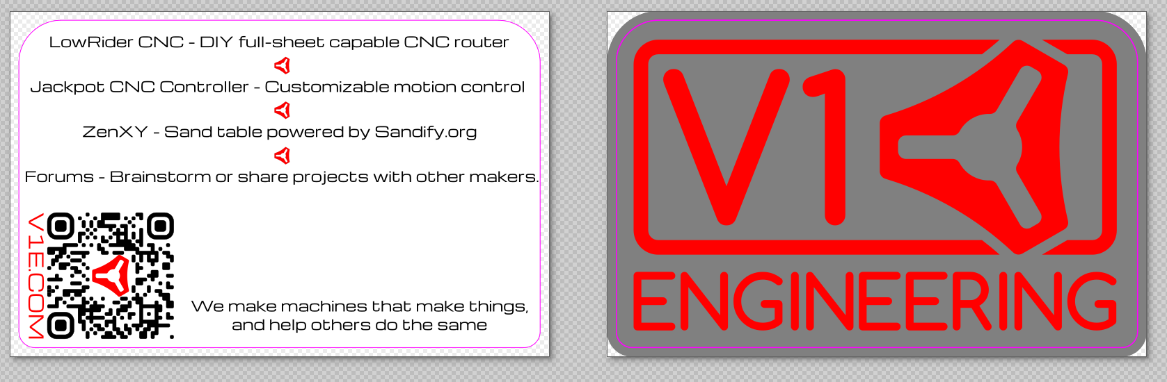
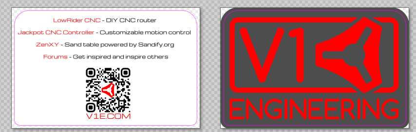
Sticker with printed back
Constructive criticisms?
What do I put for the forums?
Looks like there is some blank space what should go there?
or
We make DIY easy.
Our projects are engineered to help you make your projects
Our machines make things the way you want.
1 Like
No need to be sorry - I remain perpetually sidetracked, even after my meds kick in! ![]()
How diluted do you want your message to be?
I am sorry to answer that question with a youtube clip - this is a 20 year old clip, but it’s still a valuable resource in answering your question.

2 Likes
V1E: making machines that make things
1 Like
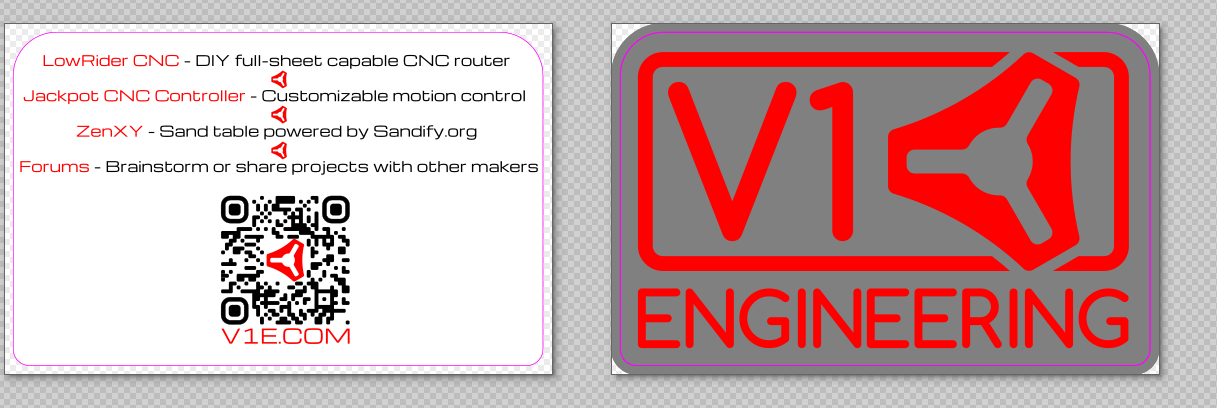
For me - nothing is particularly easy to read - nothing is really clear.
I don’t like the grey background on the red - I am not sure if it’s the tone or the colour which makes the red “whirl” a bit - that will be toned down in print and the red border doesn’t work at all - I am not sure what the reason for the different diameter radii in the corners is, but the larger one on the top makes it look top heavy. If you swap those you’ll get a much nicer balance.
I could go on and on but in a public forum it makes me look like a complete twat! So I’ll throw another version into the ring in a minute and tell you why I made what changes,
1 Like
Offset from the content. The logo has a larger radius than the letters…hmmm what happened to the G. That is the official logo though, I am not sure I want to go changing that right now. It is an old file I swapped the colors on.. stickers in the shop are the other colors.
The pink line is the cut line. I am iffy on the colors myself but I think when printed they might look good. Everything is red white and black I was trying to add a little variety.
Just trying to hand any interested person something with just a bit of info. Previously it was just, go to the website for more info.
Maybe leave room for notes, like the second pic.
Less is more. We did that last year. Nothing but one sticker and 3 machines on the table. I want to be in between that and Microsoft in that clip.
Even shorter.
Or
things for making.
This is so hard. I make something and 4 hours later I have something completely different and disslike them all. In CAD it slowly converges to something great, in Inkscape it slowly diverges to something unrecognizable, and I lost a whole day.
1 Like
welcome.
1 Like
just because you pick one doesn’t mean you can’t change it. This is a tag line for one show
2 Likes
I’ve just sent you a long message. Please feel free to post it here if you think it’s appropriate to add to the discussion.
The black is a much better background but you still need some more space around it, and that border is just adding clutter! ![]() (and they ask why I don’t have any friends!)
(and they ask why I don’t have any friends!)
i appreciate a critical eye!
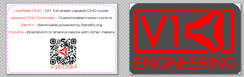
the pink line is the cut line for the printer and they require a bleed as well. hence the oversize.
I will dig into the other message soon.
2 Likes
I like this one!
You don’t have to be so literal or “technically correct” either. Lies benefit no one. But it can be more abstract.
“Come make with us”
“Make the machine that makes the things”
“What would you make with a CNC machine you made yourself?”
“Share your machine build progress at forums.v1e.com”
It doesn’t have to be helpful or correct to be on the card. The sandify shirts Bob made say, “You’re never too old to play in the sand”. Is it useful? No. Is it technically correct? Not really. Does it tell people what we do? Not exactly. If you have seen what we do, does it help you remember? Yes. Does it make people curious? Yes. What does it communicate? We’re playful. We have something to do with sand. We don’t care how old you are.
There is more art than math that goes into these things. I think you should try to put away the engineering hat for a minute and put on a creative hat or a comedy hat or your dad jokes hat. What would you say to an 11yo about it? What about a 5yo?
3 Likes
Lowrider CNC
- Accurate
- Affordable
- Fun
2 Likes
Lowrider - Quality to make money, priced so you don’t have to
Forums - Active community of makers helping other makers make more
- Help from planning to production
- RTFM-free support and shenanigans
1 Like
I think that the fewer words used, the more powerful the message.
2 Likes