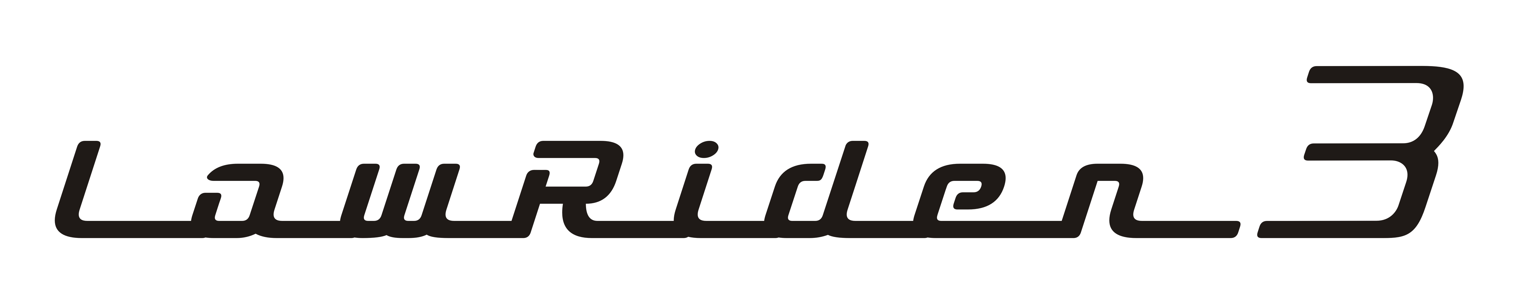
Several of these LR3 nameplates were originally posted here. However, it seemed that we needed a new topic just to hold LowRider v3 nameplate / logo text variations.
Below are 11 usable variations: 3 are tweaked versions of @bitingmidge’s original name badge, and then 8 more that I made based on the prior efforts and various suggestions in the thread linked above:
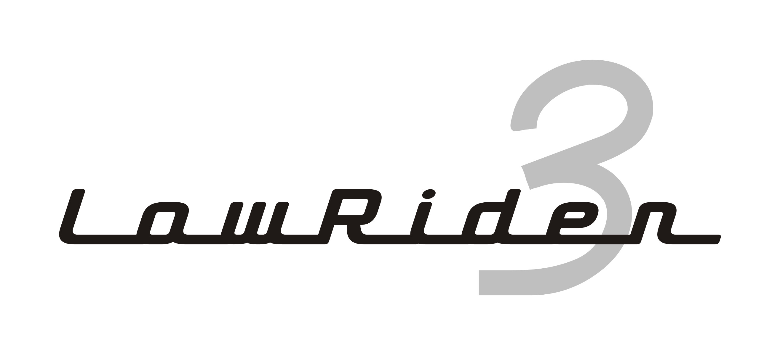
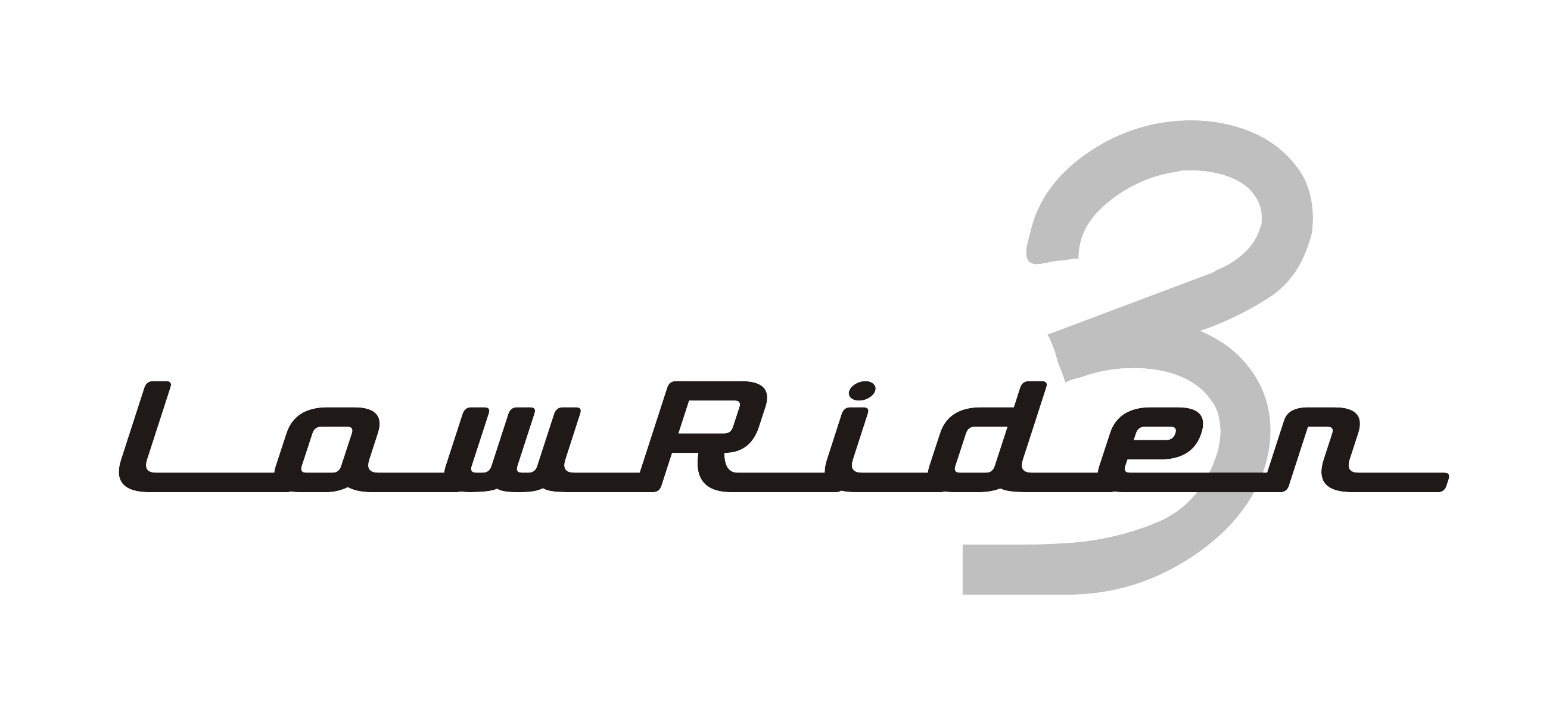
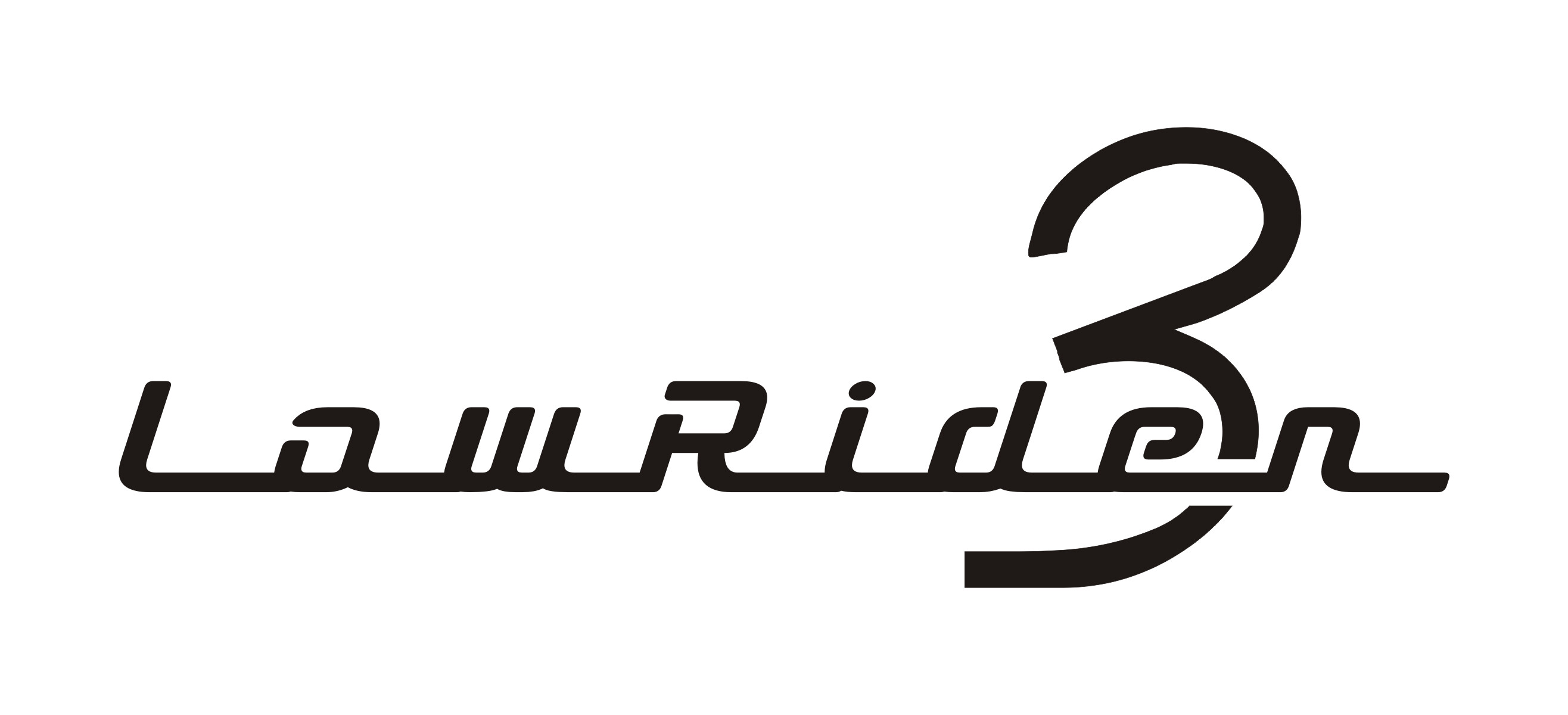
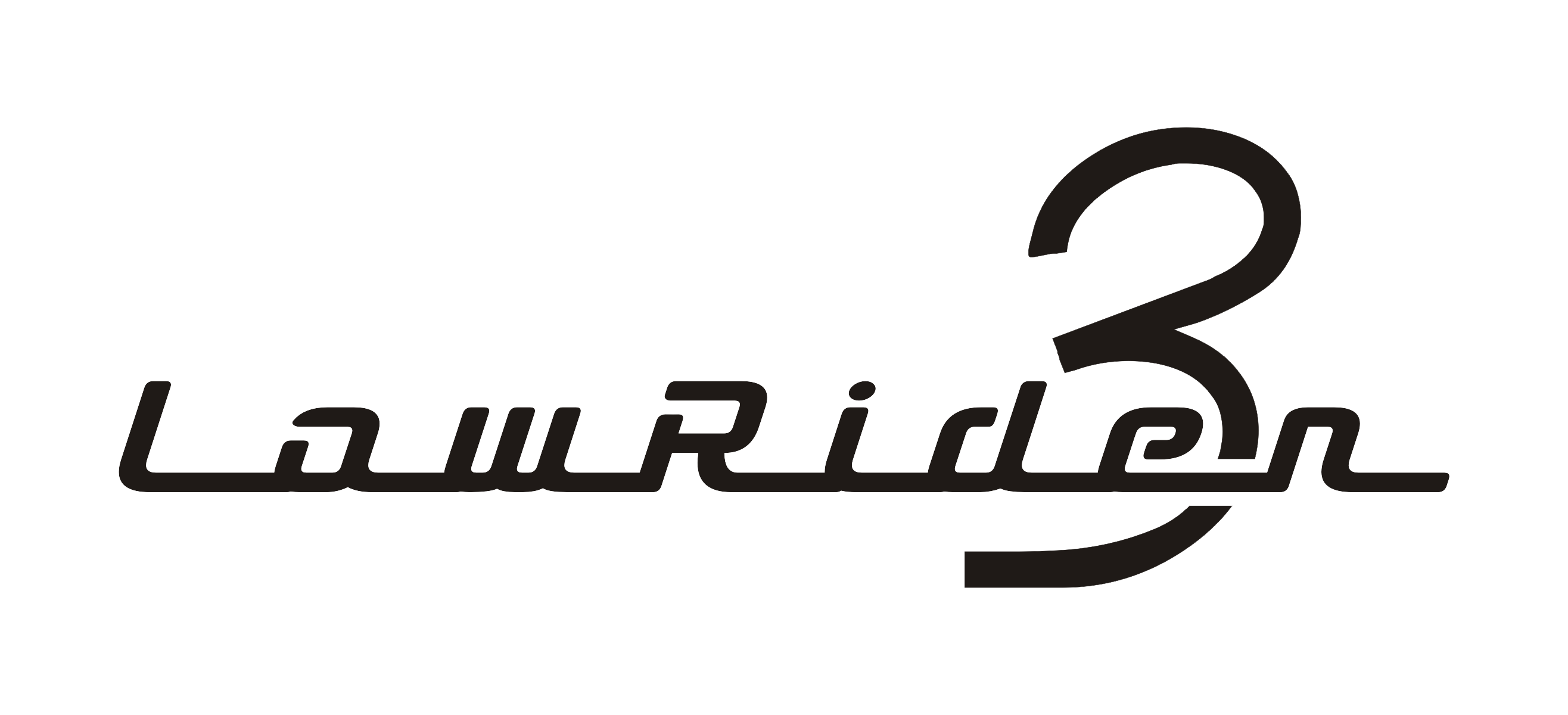
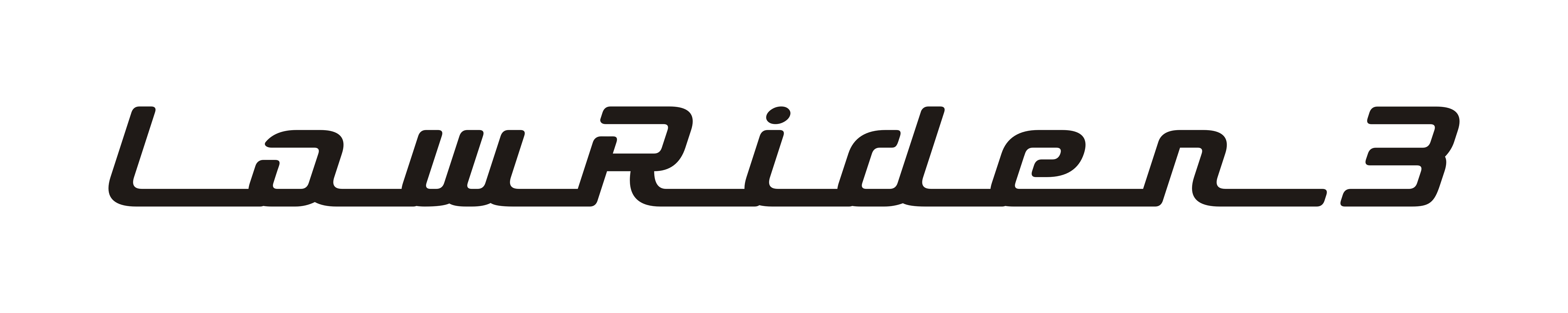
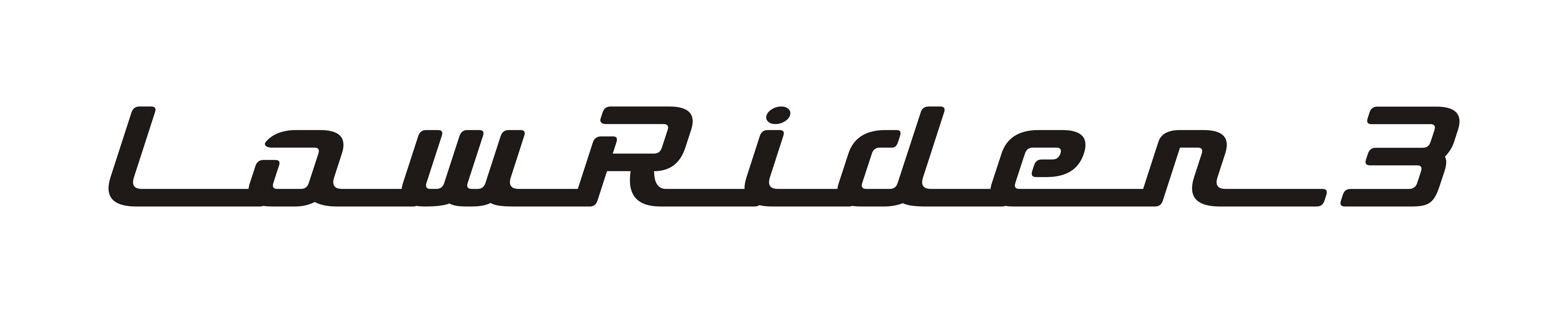
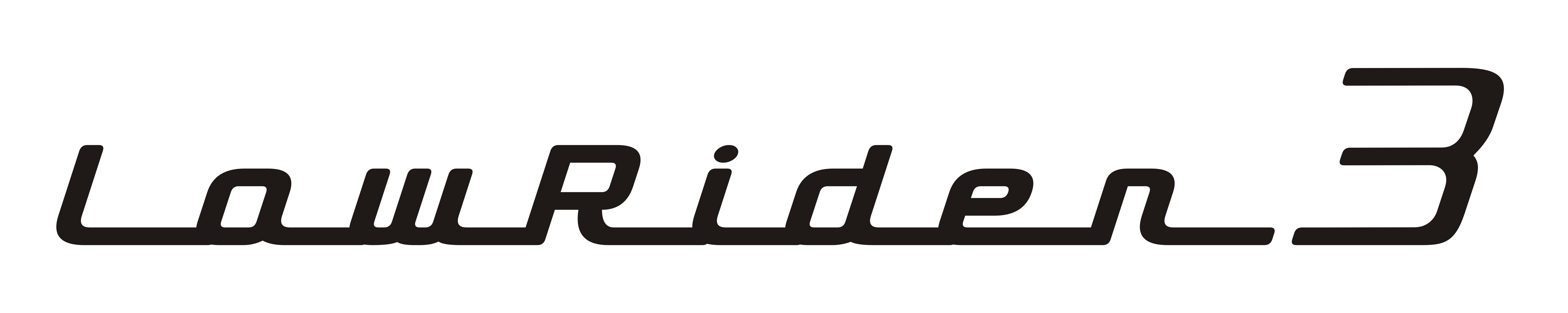
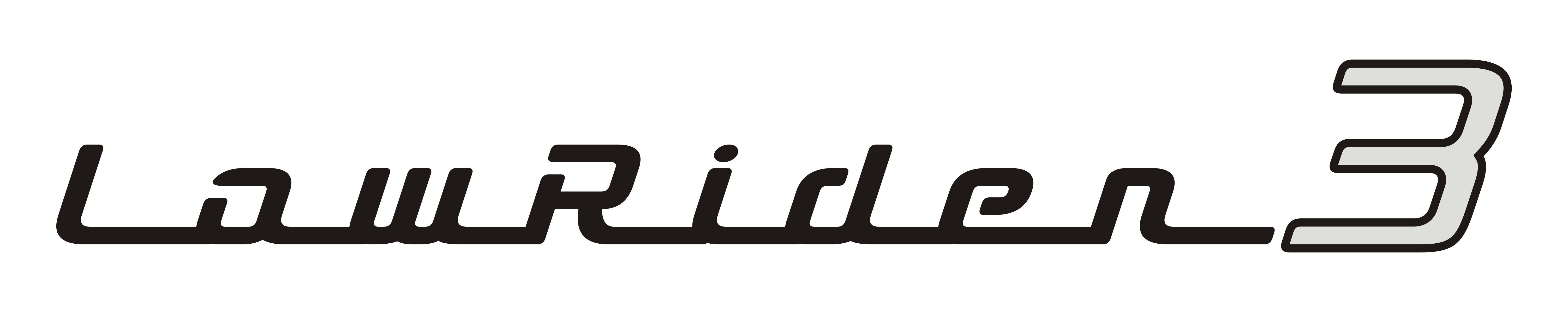
And now here are the 3 tweaked versions of Peter H’s (@bitingmidge) original name badge.
The tweaks include:
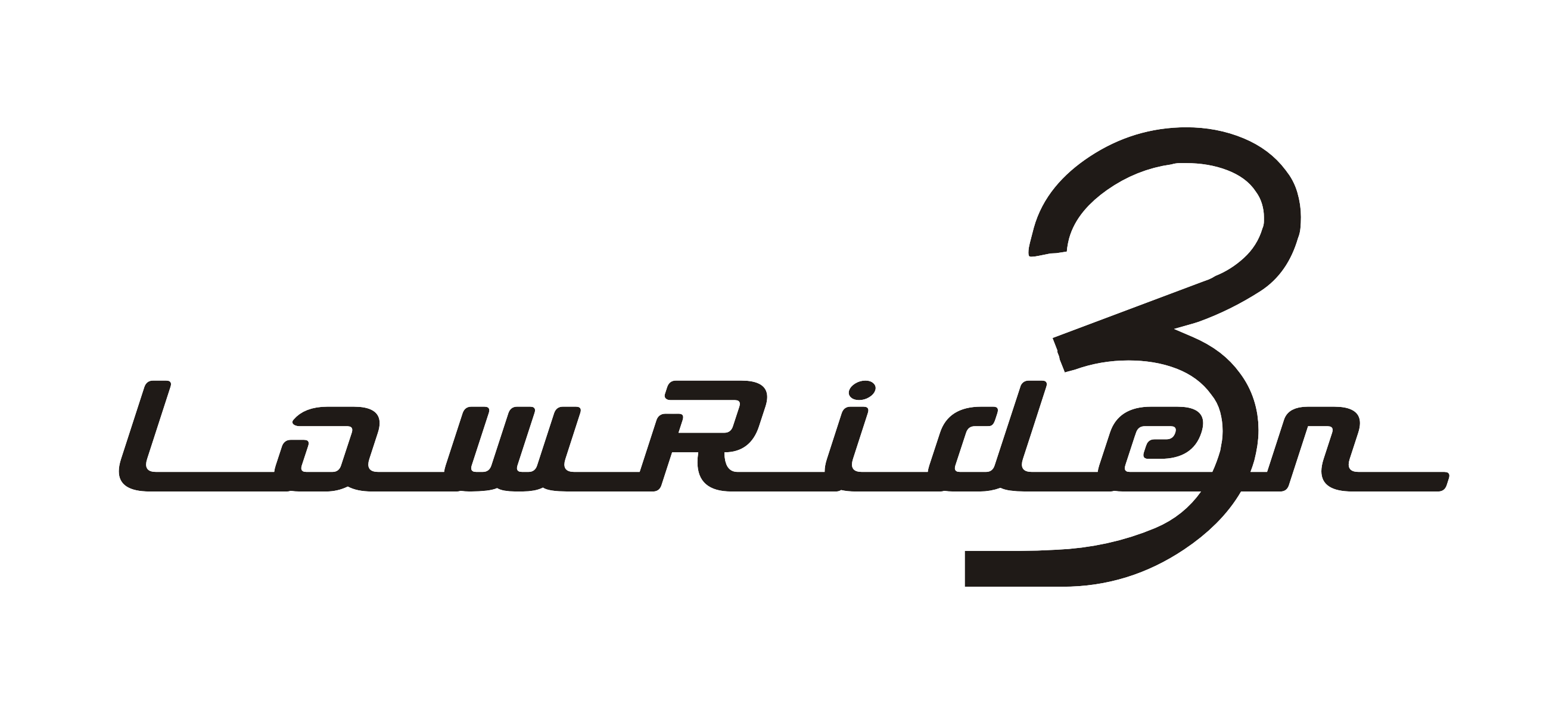
Welded the individual letters together in the name, which can help in processing jobs in certain applications (if the letters are overlapping, separate curves, then it can cause issues in certain cases)
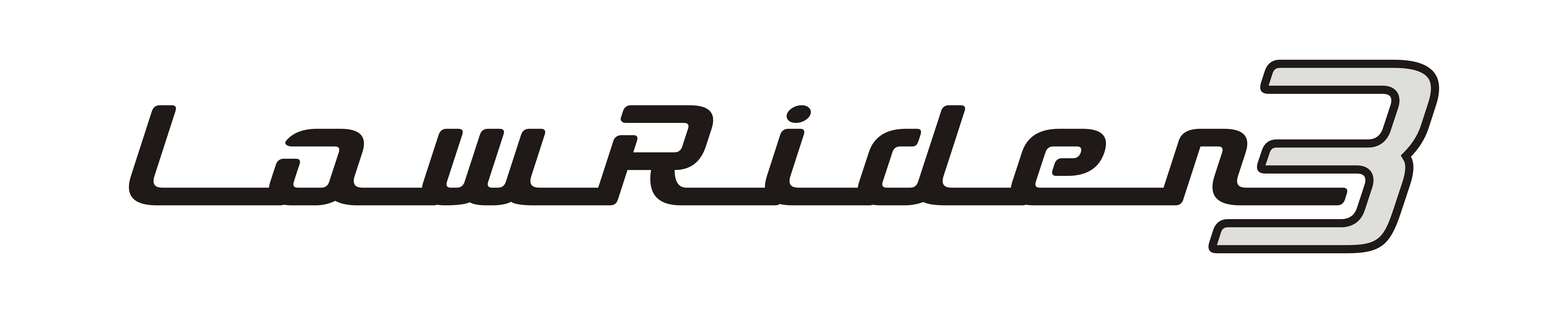
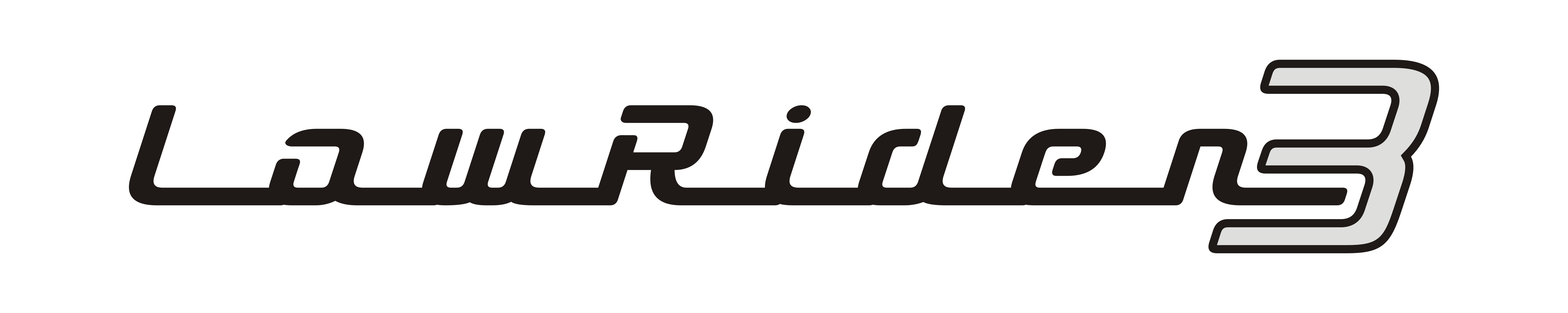
Addressed / fixed some font-shape irregularities in the “3”
Created two “stencilized” versions for when someone needs to do full through-cuts and not have isolated islands that can fall out (and in those stencilized versions, the 3 was contoured to be slightly more slender).
And just for completeness, here’s a link to my original versions - STL, SVG and DXF format so you can stick 'em, laser 'em, engrave 'em or do whatever you want or edit as you please.
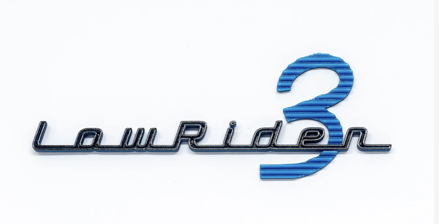
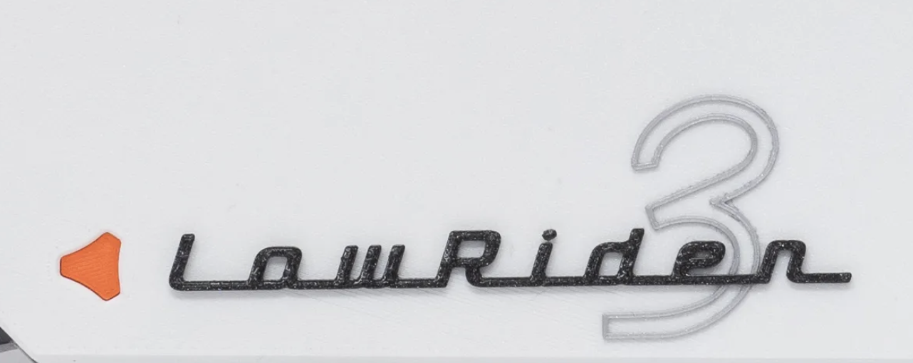
Note the little modified V1 logo is printed to a mm less thickness than the cover and stuck in from behind to add a different depth, the other badges are simple colour changes (stop print, change filament, start print) set up in the model.
And three coats of clear acrylic give them an enamelled look!
Perhaps this should be a side contest where @vicious1 chooses an official Lowrider 3 logo??
(Not trying to pin him on giving anything away…I think pride in having the official design might be enough for many. I just like the idea of having an official branded logo on it)
Thanks. The one by @bitingmidge is the winner in my mind. I’d have copied it exactly if I’d had the right font. I practically stumbled onto use of the same font for the 3 as for the name, with help from the guys in the other thread.
Did you see the link in the other thread? I guess it was too late by the time I found it, but it is called “Dymaxion Script” (the “3” only in that font.
OK, I not only downloaded the font you used for the “3” but also all your files from your Printables listing. Awesome stuff.
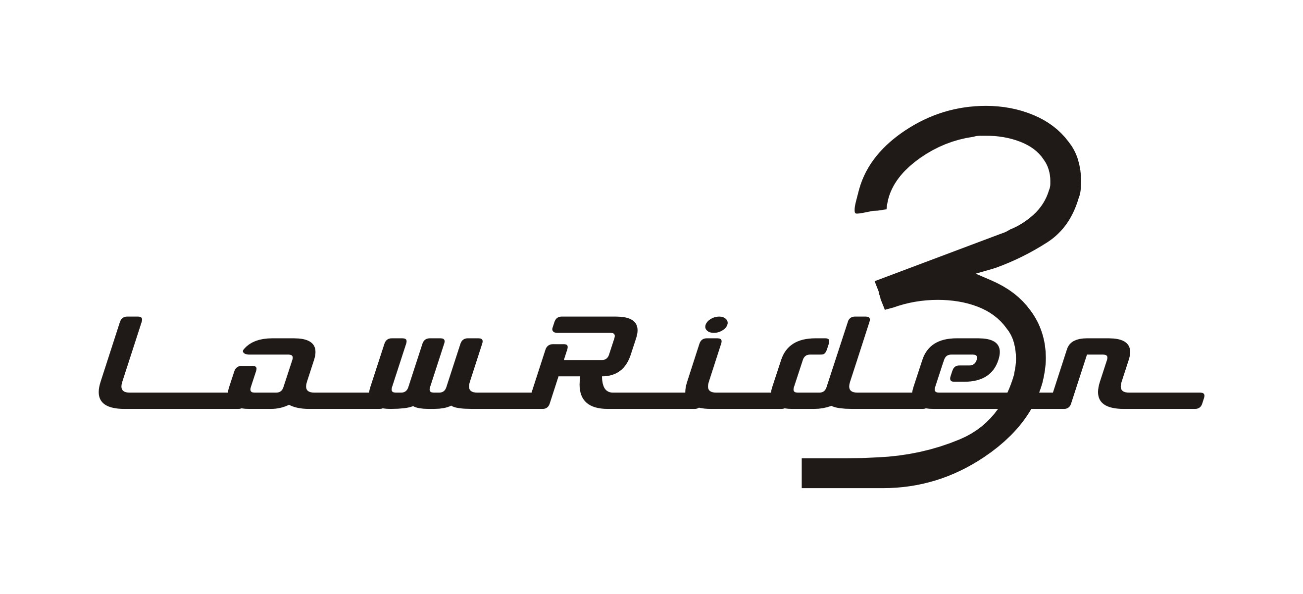
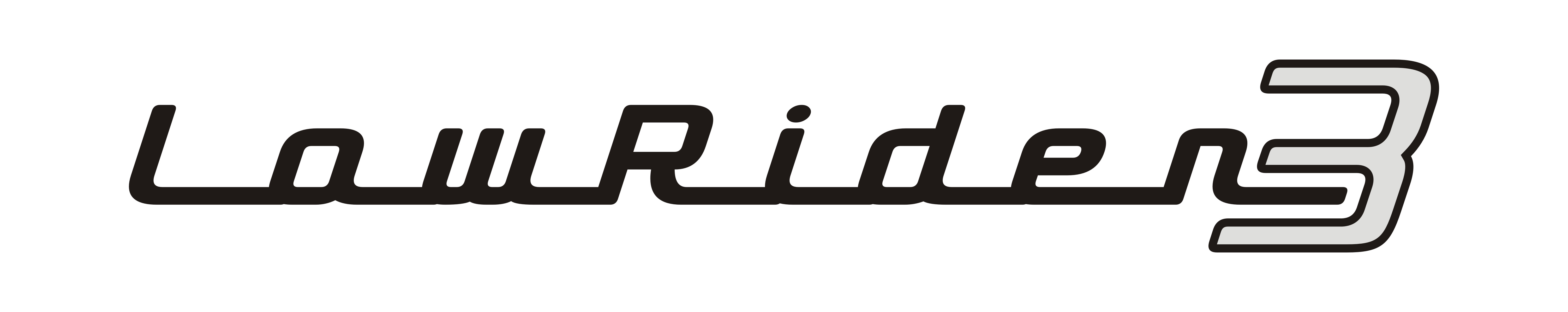
I revised the original post at the top of the thread, adding three tweaked versions of your awesome LR3 name badge.
The tweaks include:
Welded the individual letters together in the name portion, which can help in processing jobs in certain applications (if the letters are overlapping, separate curves, then it can cause issues in certain cases)
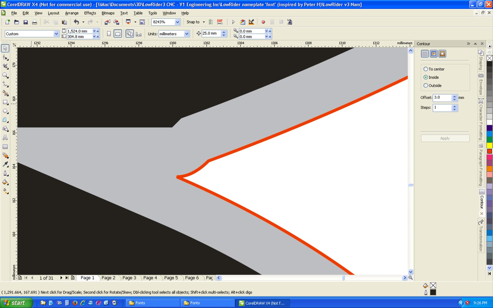
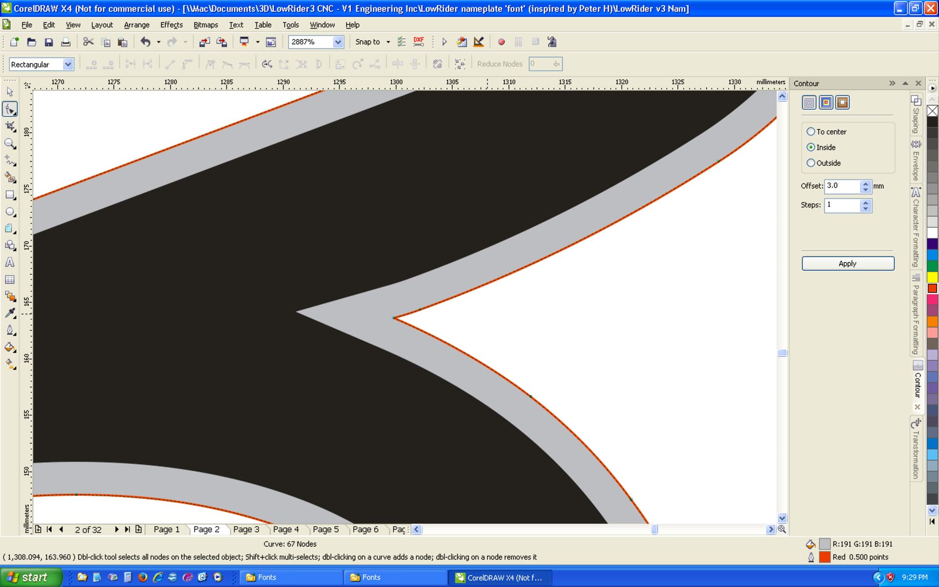
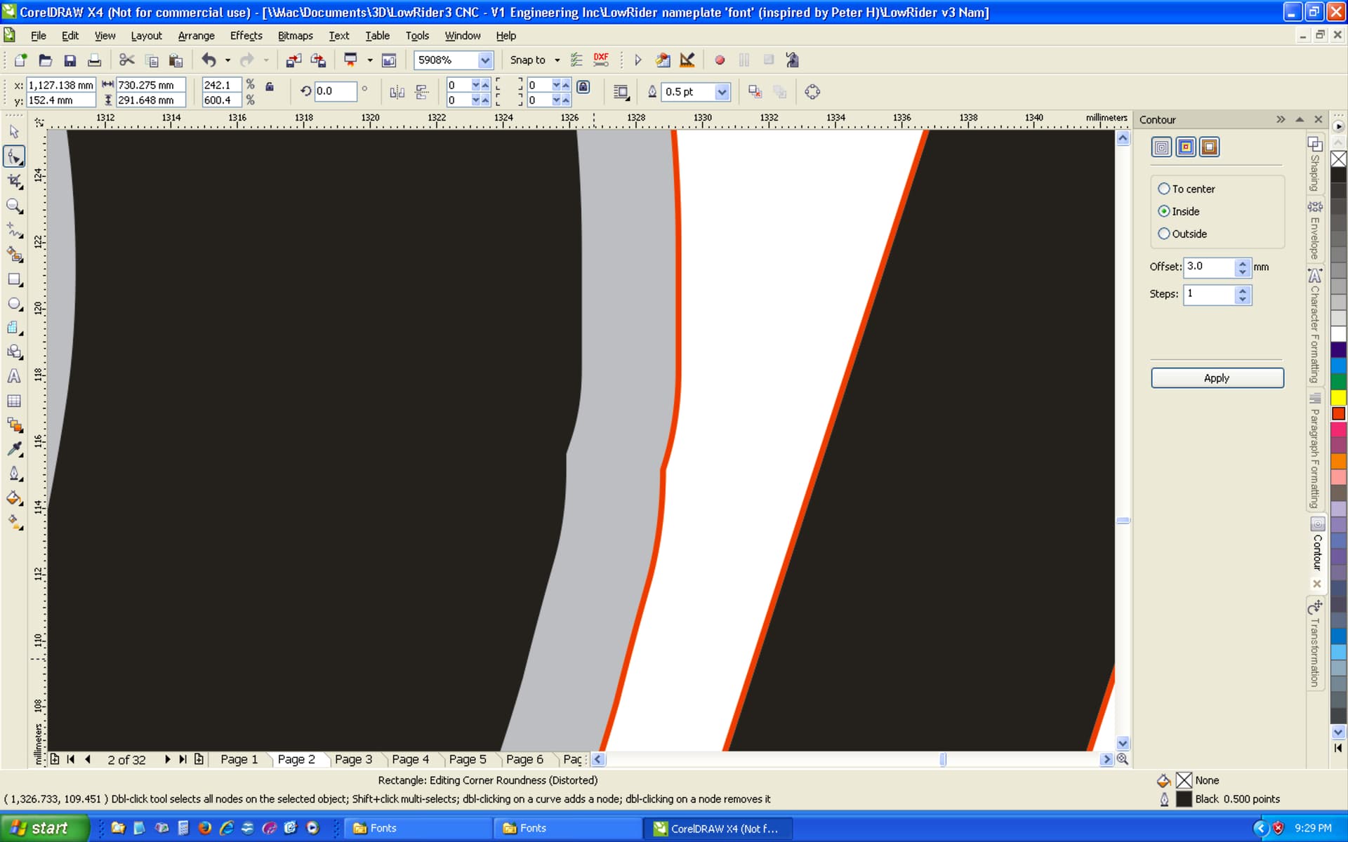
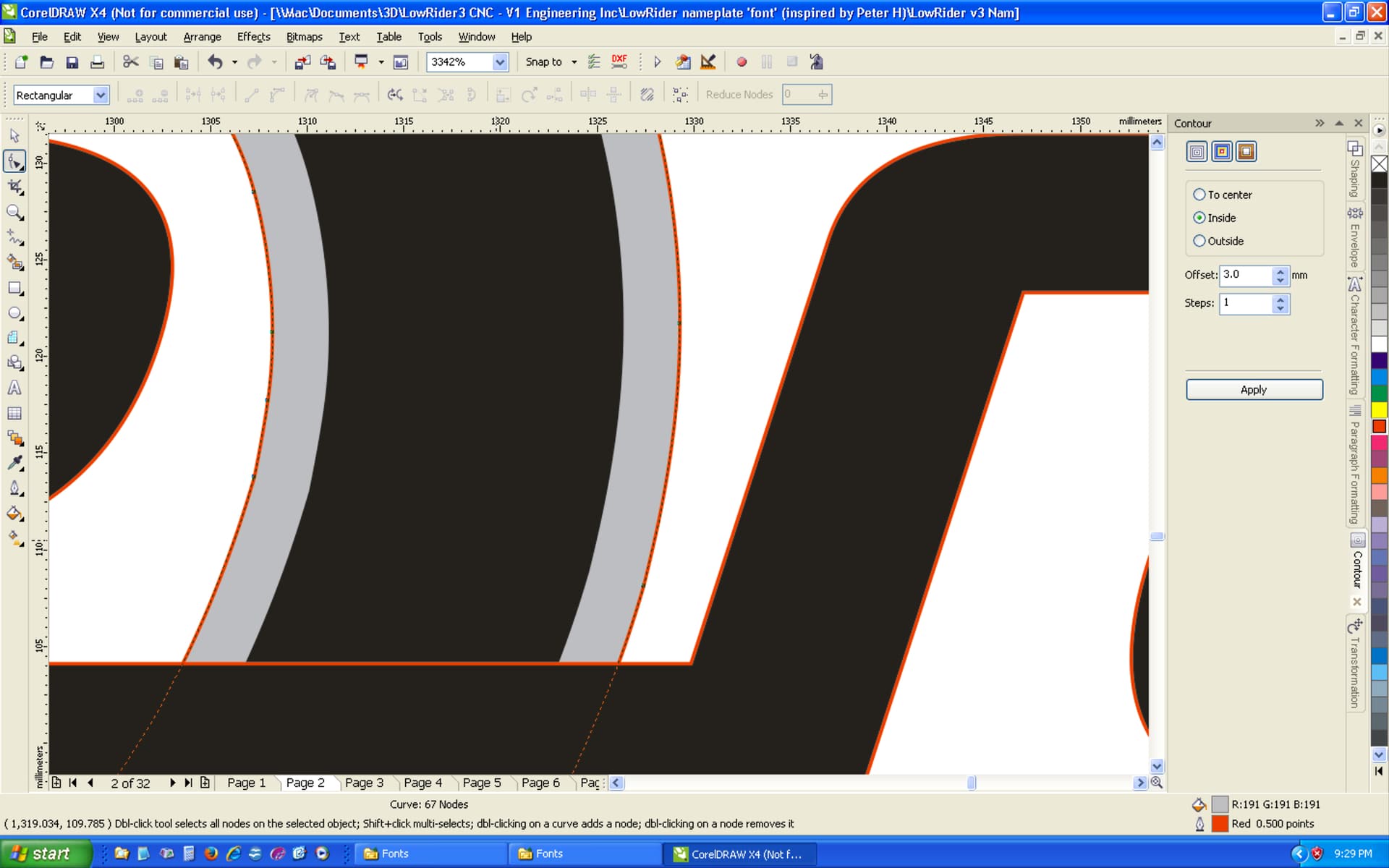
Addressed / fixed some font-shape irregularities in the “3” — see below.
Created two “stencilized” versions for when someone needs to do full through-cuts and not have isolated islands that can fall out (and in those stencilized versions, the 3 was contoured to be slightly more slender).
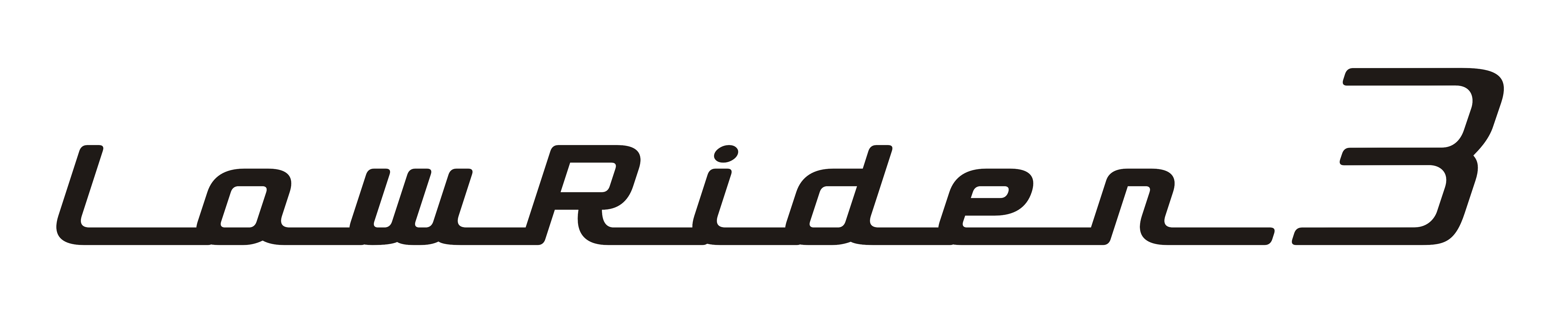
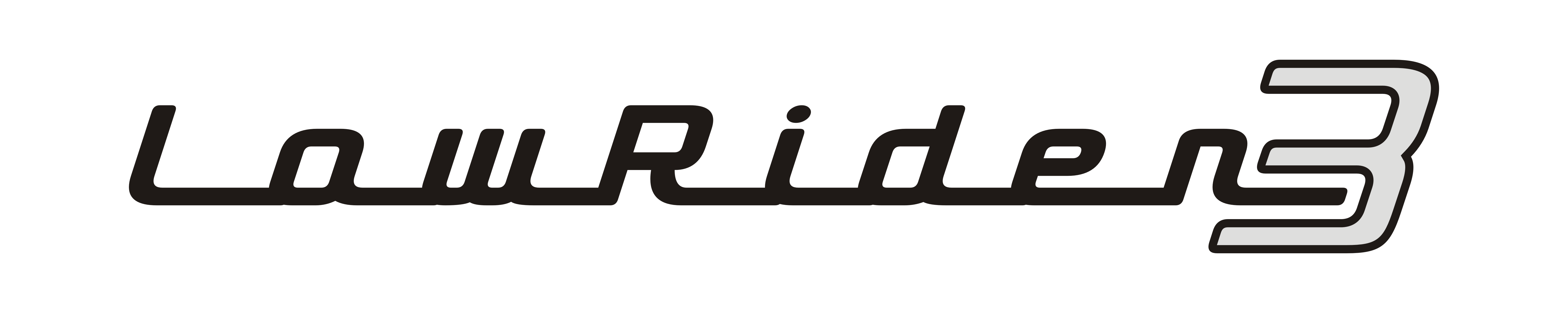
Here are a couple of examples of the font-shape irregularities I smoothed out:
That’s great work Doug! I’d like to retweak your stencil versions a little - might just do a photoshop mashup and show you and explain why, and if you agree perhaps you can change to suit - there’s no point having lots of files to confuse people!