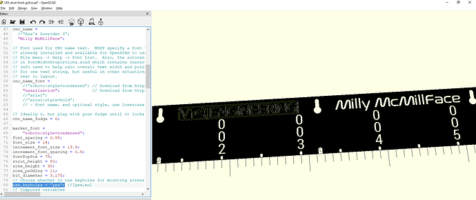
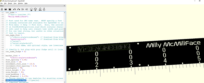
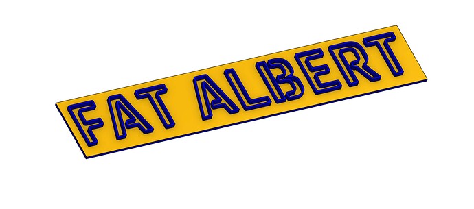
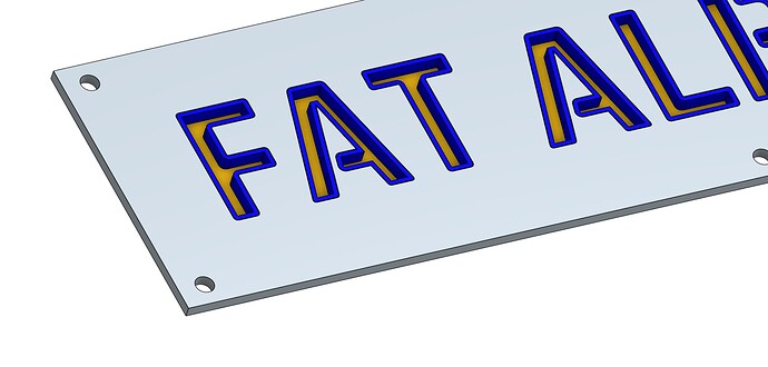
I guess it’s not bling enough, but I tried to keep it simple. Font can be discussed. ![]()
This makes it seem like you aren’t happy with it. You still have over a month until I announce a winner. Pick at it when you have time until you are happy with it!
Looks good. Your optional use_keyholes flag makes sense to me. @Michael_Melancon, thank you for submitting your pull request.
Cheers!
No problem. I was really just using it as an exercise to get to know OpenSCAD better. I’ve not really ever used it except to generate STLs from other peoples scripts.
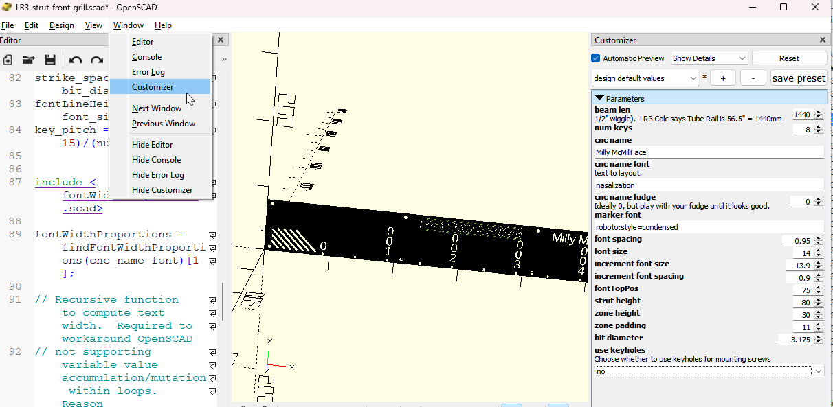
I see you are changing the parameter in code. Just in case you (or anyone else) aren’t aware, there is a Customizer window you can use to play with these, save parameter sets, etc.
That’s cool, I hadn’t used the Customizer window, nice feature for enabling Users to customize the result without directly editing code.
Cheers!
Hey, just a quick update on my entry, listed as Strut 3-A here…
I just happened to notice there is an isolated “island” present in the V1E logo-type. I created a new version of it, connecting it to the rest of the part. I updated the entry post. If you look real closely at the “R” you will see the change!
Just giving this a little bump so hopefully more people will see it. Been crazy busy at work and not on the forum as much as I would like. Still plenty of time to come up with something!!!
The only thing I keep coming up with is a smaller material left version of what I designed. Since I made it for wood I left a lot there, in metal you can make it much more open.
Go for it!
Yes. Please do!
Fusion Close but something still isn’t right.
something still isn’t right.
I think once it gets that slender, making all the diagonals cross pieces helps, but it looks pretty wild.!
This is similar to my original plan for the current build, with a solid panel where the board is, all asymmetric like a crane head, so I’m a little bit biased!
Generative design of the struts with f360 maybe ?
Fix the borders and the mounting holes, then give it to something with a Voronoi generator, and tell it to devolve to V1 logos…
Bump…. 13 days left!
12 to go…
I have inspiration for another entry… will try to post soon.
Not many to go, so here’s my remix based on the correct number of braces. There are some cutouts which still cross over the braces, but I don’t really think that’s a problem. They are of course easy enough to erase!
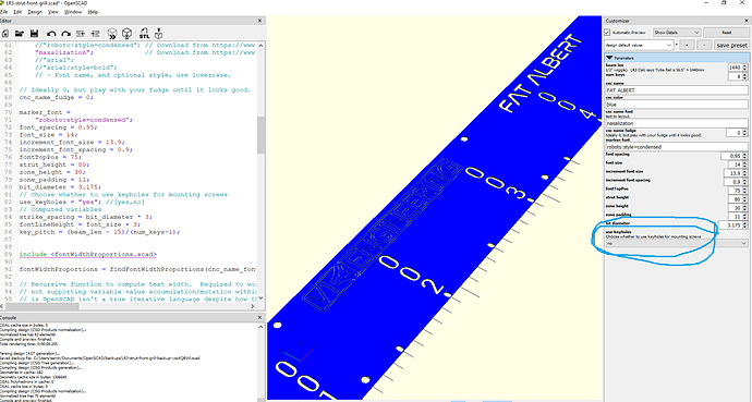
And what might seem like plagiarism of @vicious1 Ryan’s post, (and I’m happy to pass this off as his work! :D) This is actually my preferred strut (without the “Fat Albert” of course) for my LR3, something I’ve been “sitting on” for a very long time. I am hoping to do it in mirror finished 3mm composite with inward folded flanges for a bit of additional stiffness, but it would work nicely in aluminium I think. Internal corners are 3mm diameter so a 1/8" bit will work - I was just too lazy to add that extra decimal but I will if you want!
I do like the thought of the name inserted behind the aluminium, I’m not sure if I described it well enough above. It’s a single colour background and a colour change to give a raised “outline” which will finish flush with the face. It’s a simple thing to do and will look really swish!
EDIT - Sorry, I forgot about that pesky belt!
I have inspiration for another entry
My other idea did not work out so well. My above efforts stand as my entries so far.
@bitingmidge can you post an SVG of yours. Down to the end and I’m looking at a few of these but want to throw them in estlcam and see how they will work out. Winner still undecided

