LR4 (LowRider v4) SVG "nameplate" (logotype) that could be used to mark up strut plates or Peter plates

I showed these to Ryan, and he commented,

He also mentioned that these could be used to mark up strut plates or Peter plates.

V2 - more spaced out (see below for v1 that is tighter):

Preview of all (not vectors - not for use - see below for vectors):
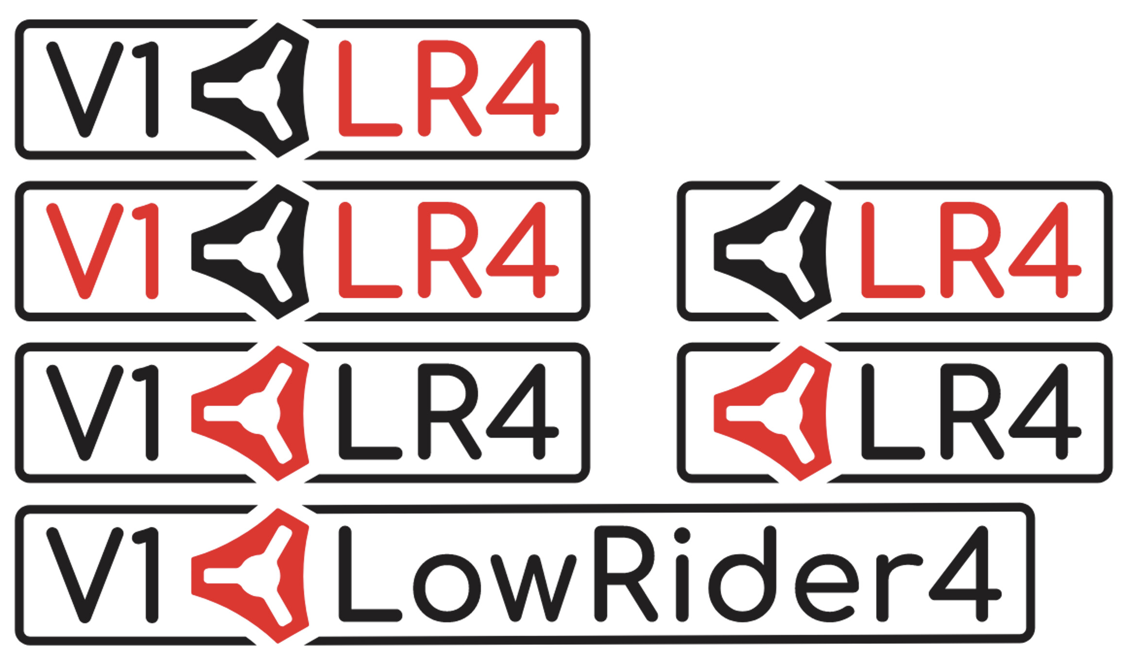
Screenshot 2024-10-23 at 3.28.50 AM

These “nameplate” (logotype) below are SVG files. You can right-click to save any one you like, or download a zip of all at the bottom.

LR4 (LowRider v4) Logotype A-1

LR4 (LowRider v4) Logotype A-2

LR4 (LowRider v4) Logotype A-3

LR4 (LowRider v4) Logotype B-1

LR4 (LowRider v4) Logotype B-2

LR4 (LowRider v4) Logotype C-1

Here’s a v2 zip file containing all 6, outputted separately. SVG (vector) format.

LR4 (LowRider v4) Logotype.zip (21.6 KB)

Also, some prefer the previous (initial) version with the tighter spacing matching the actual V1 logo more closely, so I am providing those as well — first individual SVG’s and then a group zip at the bottom. I’ll call the original v1 and the more spaced out one v2.

LR4 (LowRider v4) Logotype A-1

LR4 (LowRider v4) Logotype A-2

LR4 (LowRider v4) Logotype A-3

LR4 (LowRider v4) Logotype B-1

LR4 (LowRider v4) Logotype B-2

LR4 (LowRider v4) Logotype C-1

Original v1 zip file containing all 6, outputted separately. SVG (vector) format.

LR4 (LowRider v4) Logotype.zip (20.7 KB)

Change log: last updated 23-Oct-2024 at 3:26am (US Eastern Time)
7 Likes

Saving these. For sure my lr4 build will have the b1 option decal on its sides and the C1 on the front strutplate (modified with a little more spacing)

2 Likes

I will eventually be redoing the front strut on my full-size LR4 (and perhaps the small RC3 one I made during the beta test work phase), and if so I could switch to this graphic.

Nice, they look great. I like boring. :smiley:

Agree with this though. :slight_smile:

1 Like

Yes, could use some more kerning space between the letters. I was pressed for time and just accepted the default kerning.

Especially between letters and logo. :smiley:

1 Like

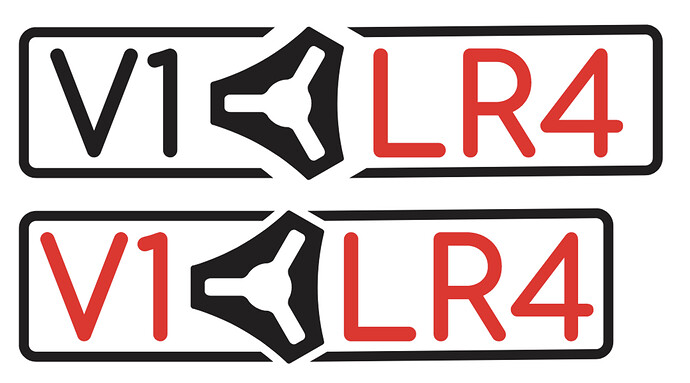
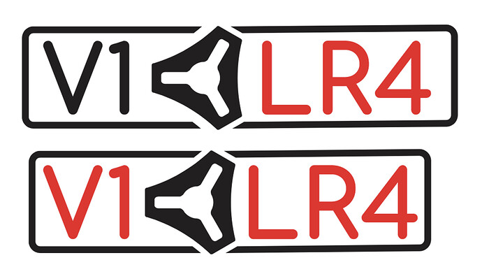
Look like enough? Top compared to original on bottom.

1 Like

You monster! :eyes:

image

:stuck_out_tongue:

3 Likes

Oops!

How about now? Top compared to bottom.

1 Like

I am redoing the variations to have that added spacing. Will editing the original post to replace them with the revised ones.

1 Like

I‘d do the outline closer to the logo, like in the second one but use the distance of the rest of the first one. :smiley:

Thanks for doing that. Good logos are hard. :slight_smile:

2 Likes

OK, I adjusted all of them, re-outputted them, and edited the top post with the new revisions.

Screenshot 2024-10-23 at 3.28.50 AM

1 Like

Thanks.

1 Like

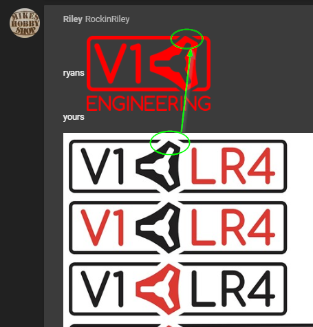
ryans image
yours


Something does not look the same, but not sure what

maybe it is just the spacing, but I thought something in the logo itself felt off

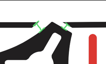
To my non-graphically trained eye, it looks like the padding for the text is too big (Ryan keeps it tight in his design), the reveal surrounding the logo is too big (again, boss man keeping things tight), and the negative space in the logo looks bigger than in the original (although that could be a visual anomaly).

But they still look really, really good! Don’t let this old man’s 'tism knock you around, @DougJoseph!

3 Likes

All caps in engineering and all is red. Do lowrider all caps and all red? If you put LOWRIDER4 in place of ENGINEERING on Ryan’s logo. I’d use that.

1 Like

I think it’s just the larger spacing here that makes it feel off
image

Puts more emphasis on it or something

2 Likes

The red is also looks like a different red

2 Likes

It is, but I believe it’s just an SVG meant for CNC/Laser engraving on the struts, so the color won’t matter

It’s not quite true red. He maybe used the colors from the site Dark theme

2 Likes

Fair, but he provided color options.

1 Like