Not sure what all is supposed to have a color but the colors that are there seem to work ok.
1 Like
The colors I think are fine. I’m mostly wanting to make sure the auto scrolling still works as expected, and that is doesn’t slow to a crawl when it fills up, making sure the setting works correctly, etc.
I have mine set to max 10,000 messages right now and I’m waiting for it to fill up so I can see how it goes
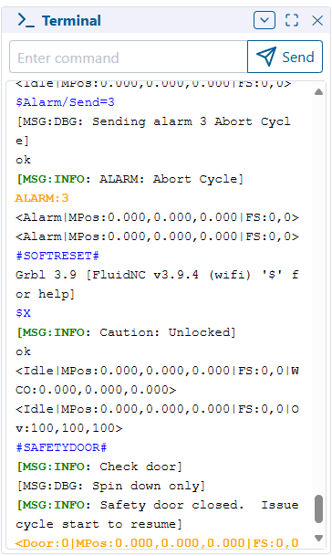
Essentially, the colors are as follows.
[MSG:INFO → Green
[MSG:WARN → Orange
[MSG:ERR → Red
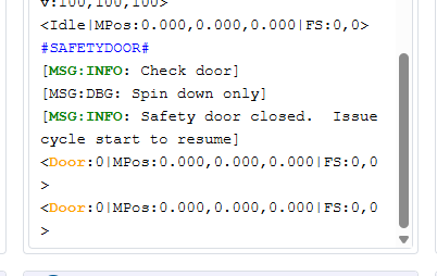
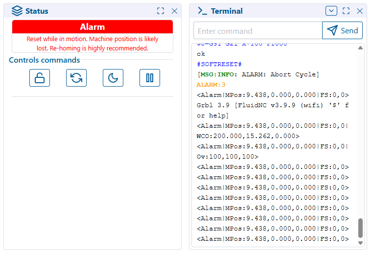
If it starts with Alarm:, Hold: or Door:, it gets an orange highlight
1 Like
I didn’t notice a difference. I did test the max messages setting it to 10 and worked fine.
1 Like
Some of it is subtle, like not including the opening ‘[’ in the highlight.
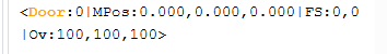
I also made it not highlight the entire line, so “Door” should be the only thing highlighted
1 Like
I’ll need to make another update. They aren’t consistent with their colons…
but it’s fine as it is just for performance and function testing
1 Like
Ah, ok.
I’m not sure how to get one of those messages to display.
I set it to 10,000 and put $SS in a gcode file 1000 times. Once it hits the limit, it slows down a lot. Might need to do something like when it hits the limit, trim it to 75% so it’s not trimming for every new command.
terminal-test.gcode (4.9 KB)
1 Like
ok, maybe this was the real slow down that was previously complained about for long running jobs…
I’ll go have a look
Ok… this should be better
I changed it to a more efficient method to trim the array, as well as batching it and cutting it down only after growing 20% larger than the setting.
so at default, it will hover between 400-480 messages max
1 Like
Freaking sweet! Color and a stability gain, maybe even a smidgen of performance. Awesome thank you (he types with a fake blood stained face neck and hands).
3 Likes
Yep, that’s better. You can see it slow down a little at 10,000 messages but not too bad. At 1,000 messages, I didn’t really notice a slow down.
With the WebUI running in Edge with my test file, the tab without doing anything was around 600 MB of RAM. With 10,000 messages, it went up 300-400 MB. With 1,000 messages, it went up less than 100 MB.
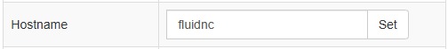
The only other WebUI thing I would like to figure out is the page title. It always shows as “undefined”. For a split second, it shows “ESP3D(Connecting)”. WebUI v2 shows “fluidnc” which I believe is coming from the Hostname (I can access it via fluidnc.local):
If I had a choice, I personally think the name in the config.yaml is what I’d prefer to show.
1 Like
How freaking cool! What a find.
Seems reasonable and easily editable for the user.
Oh. I know the fix for the undefined thing.
I forgot about it. It’s just a typo somewhere
2 Likes
I have another set of changes too that should hopefully make it a little better, but I want to test it some more before I commit it.
I had to step away to go do the things I’m actually supposed to be doing today.
But it should hopefully reduce the amount of unnecessary renders of unaffected panels that haven’t changed.
I’ll try to test some more tonight
4 Likes
OK, changes pushed
I’m not sure how much performance effect it really has due to the way the events are raised across panels, it seems they want to render anyway… but we’ll see.
Since Luc seems to consider V3 “done” and is looking to V4 now, I think I’m ok deviating more from his code and just going our own way to make it better to use
1 Like
Whoa, there is a V4??
Are you kidding me. I just came here to say I just updated the recommended files to 3.9.9 and webuiV3…
1 Like
Not yet…
He just seems to be planning it
and there hasn’t been any useful activity on 3 for a while… so I assume he’s not making any more major changes
1 Like
Cool, we have some time.
Seems like a good plan, lighten the footprint, bundle only needed panels. So far so good.
I will load up the new index files Monday, I am excited.
Thanks for taking care of that.
At some point I’ll probably remove all the 3D printer stuff and streamline the code a bit. Just to make it easier to be able to work on.
I’d like to implement some file upload verification, but that will require some FluidNC changes to be able to retrieve file hashes.
I’d also like to implement some kind of better Tablet style UI page that can just be included as an option for iPad’s etc. I like the WebUI from my PC, but it’s kind of a pain from a tablet.
Maybe rework the jog panel, or include some different jog panel options, etc.
Don’t know… I haven’t had a ton of time over the last year, but I’d like to get back to doing some fun things instead of just working all the time…
2 Likes
Yep. This 7" pendant display that I’m accidentally making feels something like what I would want in the WebUI for a tablet. I just hate the CSS library that the WebUI uses so I was looking to use something else. And everyone is highly opinionated on UIs.
1 Like
lol… when I wrote that… I was thinking I was maybe just going to wait for you to be done with that and use it as a go by ![]()
1 Like