I like the way this 2-A looks with the X belt. The only thing slightly off-putting to me is that from a distance the V1 logos kinda look like left arrows in the image. Not sure how that would translate to the actual full-size strut.
Assuming it looks ok in person, this is my favorite so far.
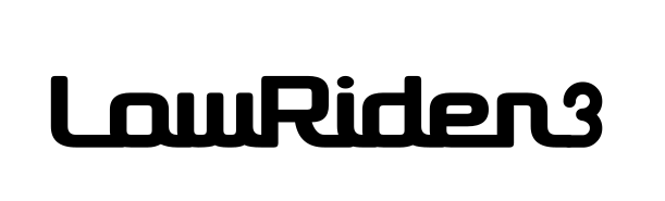
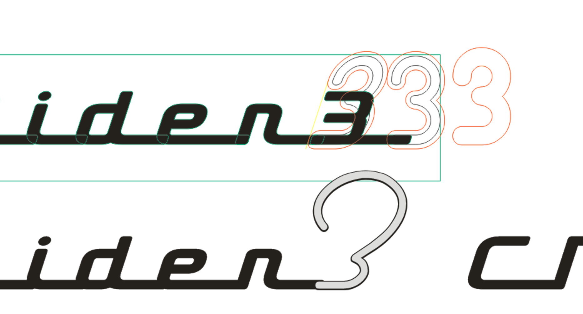
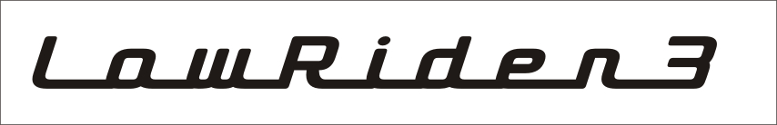
Hope I’m not throwing cold water on the LR3 logo here, but IMO the 3 kind of looks like a ?. The lettering looks great (love that font), but the number detracts from it a bit (IMO)
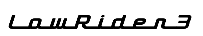
Big improvement (IMO). Might look even better if you were able to remove the trailing section and end the line at the 3 (to match the start of the line at the L)
Possibly. I do have color matched paint from when I originally built it. Should have seen the look on their face when i brought in 2 3d printed parts to get color matched LOL.
BUT I am leaning heavily toward back lighting with LED so that would mean all your logos and writing would be cut all the way though.
Really though with any of your designs @DougJoseph either option can easily be accomplished. I just need @bitingmidge to hop a plane over here to FL and “show” me how to polish them mirror like LOL
I’m pretty sure it’s Dymaxion. I overlapped it to overcome that “trailing” issue that @Michael_Melancon is discussing.
I’m not home till Tuesday, so hold tight and I’ll confirm it for you - or you can just download the. dxf file from Printables if you can make that work.
Absolutely, countersunk screws shouldn’t add anything. I am pretty sure the closest thing is the endstops screws? You should be able to go as thick as the top of the M5 screws (if you counter bore them).
Getting an idea in line with your style is not easy. I have used fiverr a few times and getting something decent is not easy. It really takes a lot of words to get what you might like. Or a few tries to figure out what you don’t like to help steer the boat in the right direction.
Design boards help, so any pictures of things you think are cool, colors, like the idea of the Blue Angles that helped.