Website refresh

Okay I think I am down to three now. Let me see if I can share them all. I have not done much work on any of these and keep bouncing between them to try and get things similar. I have not started on any of the Mobile versions yet, once the layout is right the mobile version is fairly easy to tweak, lots of this or that questions.

I can’t give direct page links so here is what I am looking at.
*Home page - first impressions.
*shop, categories - basically can be the first impression of the actual shop
*shop, everything - The shop itself
*any item that has more than one picture - is there room for a lot of info, how are other images handled. The control boards are good pages, images and lots of info.

1 - Ride - https://oek0kclbsl5tkqld-15662831.shopifypreview.com

  • less animated, should be faster loading and interacting.
  • This one lets me set the width, which I kinda prefer maybe.
  • I can control the padding between things, the others I can not.
  • The “Sticky Menu” on this one is a bit odd. The top menu shows back up only when you scroll up a bit. good or bad?
  • No bread crumbs, so getting back to a main category can be a bit of a bummer. Usually at the top of a product near the sorting info.
  • infinite scrolling, lots of products…keep on scrolling, sticky header comes in handy here.
  • shop is 5 items wide.

2 - Modular - https://isag2xho20qpummq-15662831.shopifypreview.com

  • more animated
  • full width, I am not used to that but it is growing on me.
  • sticky menu is how I expect. Home page see through to always there menu.
  • Categories page text has to be on the image, so I have to darken them to see the text.
  • shop is 4 items wide, bummer on larger screens

3 - Palo Alto - https://d1swsgg94ox3to7u-15662831.shopifypreview.com

  • more animated
  • full width again
  • sticky menu
  • Categories, text on image again
  • infinite scrolling, lots of products…keep on scrolling, sticky header comes in handy here.
  • shop is 4 items wide, bummer on larger screens
If we can narrow it down to two I will put in some effort to get them similar and then work more on the mobile side as well.

Ryan,

Between 1 and 2 I like 1 best. The #3 doesn’t look like it is as finished as the others, so I’m not sure I can comment on it.

Mike B.

1 Like

Okay, you think I should keep going on them all to give a better comparison.

When you scroll down you can see the animations and stuff but yeah without any of our content it is pretty hard to envision.

#3 does it for me! 1 and 2 seems too cluttered to me.

1 Like

1 and 3 are my top 2, but many of the images on 3 are not showing (ie grey default images). That may play in to why it looks easier to navigate. Either way, 1 is my fav.

1 Like

#3 is having a few errors. I am going to reinstall that one and start fresh. It has a ton more options but it seems some things just are not customizable.

Let me get them a little further along to get a better look.

adding a new link to this and the previous post. https://d1swsgg94ox3to7u-15662831.shopifypreview.com Still seems to have some issues I think

I like #1 the best. I think KISS is key here. You have your product line up there first, then News, Shop, etc. It is how I would want to see it if I were someone new looking to find out information on what you are selling. The others are ok, but I very much dislike having to sift through “news” and “rave reviews” to find information on what product I am at the website to find. “Here is what I have to offer you.” “Here is what people are saying and where we are mentioned.” “Here is how to purchase.” “And if you need help…” which is how #1 is pretty much set up.

Just my $0.02…

2 Likes

I like these two the best - but I’m old school and hate most modern “marketing” sites that are all animations and no product information.

1 Like

Thanks for the feedback. I do agree.

I will arange them so they are in the same order as I get them all more complete.

One only offers square buttons…I hate square buttons so I think that is out.

I agree I dislike most ultra modern sites, but you have to stay fairly current or you can quickly become old (AOL looking). I am trying to balance subtle animations and a subtle modern style. I remember the last major revamp to the site we did away with the left-hand menus and all that, I hated giving that up…but now I can’t believe some sites are still left-hand menu’s. So change is hard for me as well but I know it has to happen.

It is definitely hard to not join in with the latest website fashions. But whether you like it or not, our brains get trained on what style looks cheap and what looks expensive.

V1 may be allowed to be a little more on the cheap side, because you aren’t trying to be a luxury brand. You’re a practical one.

I like the look of 3) and the first bar with the sliding pictures is really cool. But I do worry that it is too hard to use. People just coming to the site won’t know what a low rider or mpcnc is, so they won’t know those links go to different places. Make sure you replicate that content somewhere else.

I also think it’s important to point out what the goals of the first page are:
a. Show off a little. You have been doing this for 7 years and it isn’t your side hustle. People need to know this is a real business.
b. Table of contents. Find product info on the MPCNC, LR3, or ZXY easily.
c. Encourage people to dive in a certain way. Point people to the store, the forums, the docs. Instead of letting them find these things through google or links in the forums
d. Post News. I think this part is maybe more likely to be in the forums now, or via twitter or something. But there is extra gravitas to things you post on the home page, and not somewhere else.
e. Shape user expectations. This is sometimes the first impression. Are the machines like project cars? Are they like an HP inkjet printer? Are they a user experience? Are they rugged tools for contractors? The more you tell the correct story here, the less re-education you’ll have to do in the forums, or in sales, or in support. It is flexible, but I think you know where you want to be in this regard.

Or maybe your goals are different. Look at each of these from those perspectives and decide which one(s) meet all of those needs.

3 Likes

Honestly though, I think any one of these can be used to meet those needs. Each of them could use some tweaking. But I think you are selecting between several winning options.

Good idea, I can slide that down and replace it with the static image like the rest.

A- Oh, year 7 years is something to be very proud of.
d- A link to the updates section is probably a good idea. I usually only use the blog feature for larger stuff. Or I can start using the blog more…
e- the summary, catchphrase, or similar. I get it I think. If I can get the sections good I can add more details to each one. I think you can see some I do have a little boasting about the users. I liked that and wanted to do more.

Yeah super not easy. It is all there but it is kind of like it’s own programming language for each one. They all label things different and to try them out I have to add words and pictures. The whole time I do it, it is flashing and refreshing to WYSIWYG my changes. Pretty rough on the eyes. Only a few hours at a time, last night one eye literally started twitching.

I think it is getting close, then we can really dial it in. I kinda miss programming my own page, in the end it was easier. (must be what Linux users feel about all the clicking in the windows gui)…

You can easily spend as much time on this as you want, and it will still be getting better. That’s the real work. It isn’t magic, it is labor.

Yeah. I would try to lean back in your chair and look at the site and see if that perspective “feels” right for V1Engineering. Adding people to the images is something that would add to this feature for me. Because it is about the process and it is about the people. I know that is super hard, and I like the steps you’ve taken (“The Best Users” … “Make the Best Projects”). Is there a way to make a close in, slo-mo shot of someone’s hands while they are installing a bearing, or sliding a truck on a tube or something?

I’m being very optimistic with what can be done. I know this stuff is a lot harder than it looks.

1 Like

I love the ideas. Definitely at least get some hands in there. I would love to get someone…maybe even me.

1 Like

Its when you start to drool that you have to stop 1😅

1 Like

Amen to the brain !!!

2 Likes

P.S. I am still chipping away at this. https://0p7fw9nx7p9w91qj-15662831.shopifypreview.com
A lot of it is placeholder and editing and new pictures need to happen. For all the small things I do not like I have a friend from my Robo days that can help with the Shopify theme editing.

@vicious1, @jeffeb3 and/or others, [http://forum.v1engineering.com] uses Discourse.org, can you configure with CORS enabled for requests originating from docs.v1engineering.com?

Since build doc markdown can contain javascript (e.g. LR3 Calculator), am wondering whether build docs could also contain javascript that uses forum’s Search APIs to markup Build Doc steps with additional context/links if/when Maker needs hints (beyond the build step text) on how to proceed.

Example of why/why-not, risks, and how to enable CORS is available at:

If you decide to enable CORS, then CORS would need to be enabled, AND, http://docs.v1engineering.com and https://docs.v1engineering.com need to be added to “CORS origins” field, don’t add wildcard. Am unit testing with mkdocs running locally on http://docs.v1engineering.com:8000 (where docs.v1engineering.com resolves to 127.0.0.1 on my Dev Box), I don’t think enabling another origin for the 8000 port is needed, but I could be wrong, we’ll see…

Discourse Settings → Security → CORS origins

Reason I ask… Wondering whether Maker build experience can be improved by helping to close the gap between specific documentation steps, and related forum topics. Goal is maximize joy by reducing time to understanding, reduce repeated questions on the forum, increase context associated with trickier build steps without Ryan having to update the doc.

Currently, topics can have tags scoped to specific projects. Topics can contain links to specific build steps. But Build Documentation readers are currently oblivious as to how many questions have been asked relating to a given build step, in a way that’s easily discoverable, directly from the build step they’re currently working through.

Thinking that adding some code to the docs can help auto markup header for each section with additional ‘badges’ that link to forum, video and maybe other actions (?) that enable Users to quickly dig deeper and self help if/when they’re stumbling on a specific step.

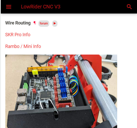
Imagine the following example, but with search hit numbers in the “forum” notification badge. Hover/Clicking reveals popup that opens related forum Topics. Need APIs to work from docs.v1engineering.com to enable this scenario.

If interested to see more, enable CORS and I’ll try to share a pull-request/prototype.

Alternative options that don’t involve enabling CORS…

  • Create scheduled task to periodically query forum APIs, generate and publish index/metadata to somewhere that Build Docs can access and render. Data will be as stale as the time between run intervals. Less, and smaller request payloads.
  • Create a service to proxy API requests in a way that doesn’t care about CORS policies of upstream API. Involves burning time creating and maintaining another thing.

I am hosted on both sides. Gihub.io and discoursehosting.com. Would that still work.

I have not had enough coffee yet, but I will look at this again in a bit.
I do not have full admin control of the forums, but I can make requests.

Our current situation, my main goal is keeping track of how often something gets asked here (and FB, reddit, etc). If something gets asked multiple times, I try and edit the docs to contain any missing information. We have the added cheat here of autolinks (test crown), to point to a docs page. What I think would really help is a troubleshooting flow chart in the docs, but that has proved to be very difficult.