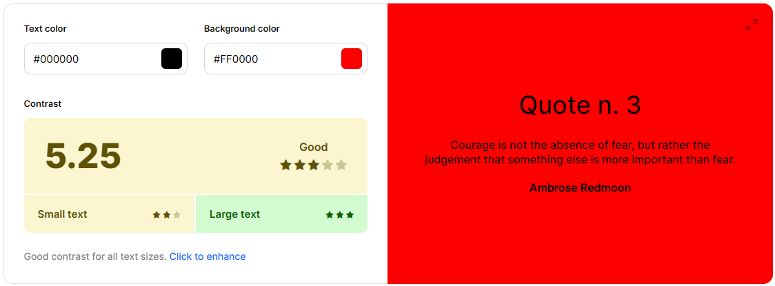
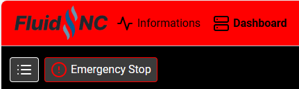
Black text on red background is rough on my eyes.
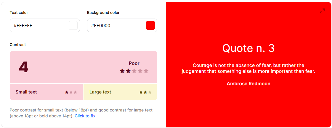
Makes things hard to read. Needs more contrast. The white text on red reads better
Black text on red background is rough on my eyes.
Makes things hard to read. Needs more contrast. The white text on red reads better
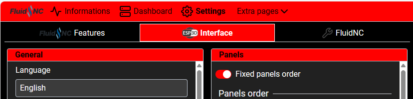
I agree about red being tough on the eyes. Red is tough to put in a color scheme. The V1 logo is using the reddest of reds (#ff0000). It’s especially odd when red has functional meaning like for emergency and stop.
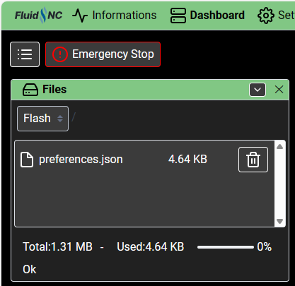
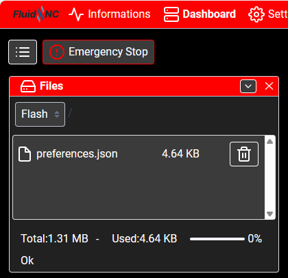
I do think it would help to make the header not as tall. That’s a lot of red. And maybe make the panel headers a different color.
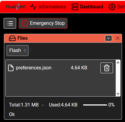
Currently:
Smaller header and different color panel headers (not sure about that particular color):
The hardest part is done. Modifying colors now is easy. I think I’ll end up putting some kind of key at the top so people can modify the colors themselves. Like right now, if you want to change red to another color, just do a bulk replace of “#ff0000” to the hex color of your choice. I could probably expand on that concept. It might be fun to do that to make the theme match the color of your CNC as an alternative to using a custom logo.
This took 2 seconds and changed a lot more than is visible here:
Interesting, I find white on red to be worse.
According to this color contrast checker, black on red has better contrast than white on red.
Color Contrast Checker - Coolors
To Doug’s point about too much red, I think I’ll probably change the tabs on the settings page to not be red.
I’m happy to keep making changes if there are suggestions. I’ll try and do what makes sense for default values. If someone wants to tweak it later to their preferences, it shouldn’t be too difficult.
Thanks for the input!
It is hard the main site took a long time to get something I didn’t hate.
Red, black, white, and a couple grays.
Thanks! You are the man!
Yes, that darker red is better for both contrast and aesthetics
Many grays is very modern feeling (to me). I like it. A soft gradient of grays gives it a more 3D feel too.
There was a chrome plugin called “stylish” where you could edit the style of any website. That may make your workflow faster to just edit it in the browser. It was great for the worst offending work websites that make my eyes bleed. I usually just used it to turn some black on white into white on black.
I’m using the repo that Mike set up which makes this pretty easy. I’m mostly using Chrome devtools to select elements, see where the style is being set, and override it as appropriate. Sometimes I’ll edit the style in devtools to try it out first. It’s pretty efficient.
This reminds me of using Greasemonkey to alter page styles but it’s probably been at least a decade since I’ve done that.
Still messing around but this feels a lot better. Since there’s a lot more contrast, I toned the white text down a bit too. I also made the background a really dark gray instead of black.
I went down a few rabbit trails.
That looks better.
It seems like V3 has untapped potential in a few places. I really hope we get to see the backend start to get refined from the devs soon.
@jeyeager, you are a rock star. Please share that newer one. Thank you!
Here’s the updated dark theme. I should get around to updating the light version this weekend but I keep tweaking things.
theme-V1E-Dark.zip (12.6 KB)
Updated the tabs on the settings page.
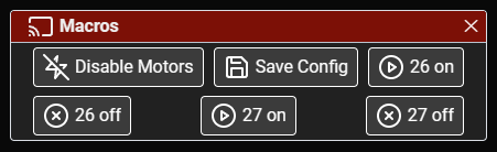
Updated it so the macro labels are still displayed in mobile mode. Otherwise, only the icons display.
Other random things, like if you have the “Informations” page displayed, the status box didn’t line up.
Thank you for sharing this!!! Excellent contribution.
Also…
…I cannot thank you enough for doing this. I truly could not identify the macro’s from “icons” alone!
That’s looking very attractive now. Definitely easier to read.
Have you tried any different fonts?
I did change the font to Roboto falling back to the default sans serif font. It was a subtle change. I suppose I’ve only tested on Chrome/Edge on Windows and on Android, so I’m not sure what it looks like on iOS.
I can try some other fonts if you have any suggestions.
@jeyeager
It looks great. Thank you for adding the Macro names to the mobile view too.
I’m curious what we’re waiting on for the V3 WebUI to be recommended? Is it just more testing or are we waiting on something from the devs? I haven’t actually made chips with it yet but it has some great features.
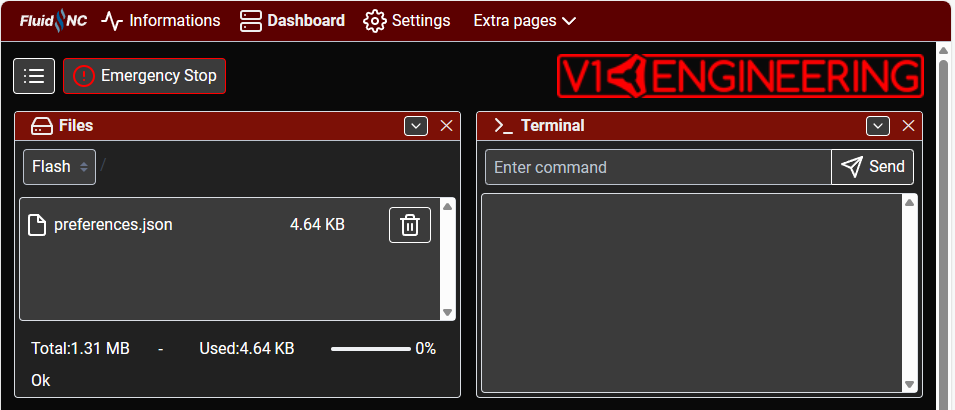
I see there are some things to update in preferences.json. The default settings for the Probe panel should be updated. Although, I just have that in my gcode so I’m not sure how that works from a workflow standpoint. There are a number of panels that whether they should be displayed or hidden depends on your setup (such as the Spindle and Laser panels).
Current work in progress as a means to learn the extension capabilities:
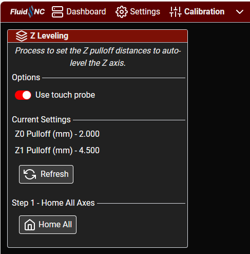
It can currently read the pulloff settings and home the axes. I know how to manually send gcode and retrieve values. The plan is to have it probe the left and right sides a few times, perform the math, and auto-update and save the pulloff values. You can certainly Z level without this, but it would semi-automate and guide you through the process. I think similar could be done for the auto-squaring. I know this is targeting the LowRider, but if there’s something similar that makes sense for the MPCNC, that may be possible as well.
I have had mine need to be reflashed twice. It just stop reading the theme and the preferences…really weird. There are other changes I think the Fluid team has already pushed but have not made a new release yet.
The one I put on github?
I have not really had time to sort through the preferences much. Once I get the stuff shipped out to RMRRF, I should have a free week to work on something…maybe.
That would make things real easy.
Weird. Was that on 3.7.15?
Yea, specifically this for the probe settings:
  "probefeedrate": 20,
  "maxprobe": 15,
  "probethickness": "1",
I think that should be 200, -80, and 0.5 to match the default settings on the Jackpot instruction page.
G38.2 Z-80 F200 P0.5
It also has a tablet extension setup but no html file for it. Not sure if that actually exists somewhere.
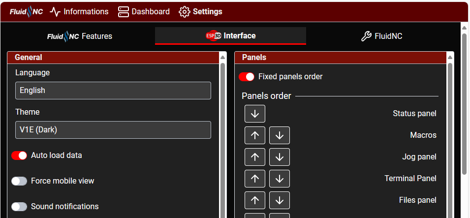
Also, not sure if it makes sense to show the machine settings by default. Not sure I’d ever change any of those settings except maybe if I was going to setup soft/hard X/Y limits.
"showmachinesettings": false,
That enables this tab:
Ha, no rush from me. I was just curious.
Do you have a clean Preferences file, I can load that into github.
It doesn’t. That was something I was working on, and I forgot it was in there when I shared the initial file