Edit: This thread was initially an attempt to troubleshoot how to trace my own handwriting for plotting. I eventually figured it out, thanks a lot for all the useful input. I’ve summarized my findings here.
I’m planning to write long and stupid christmas letters using a pen plotter and chatGPT. I think it’ll be fun!
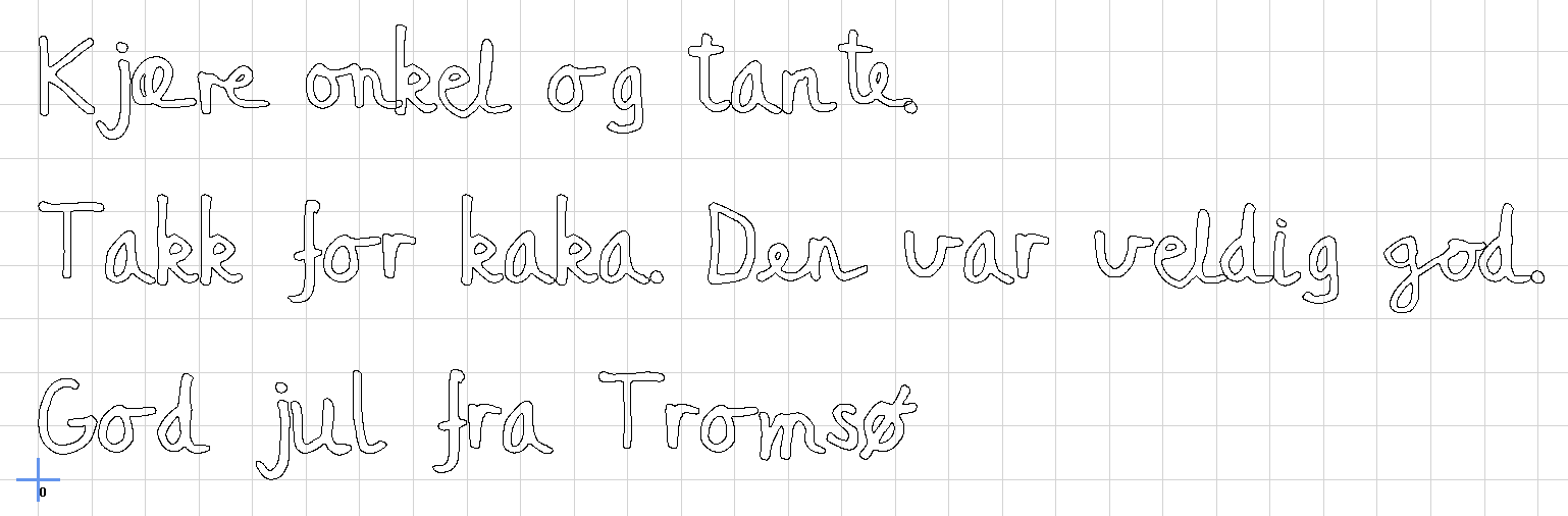
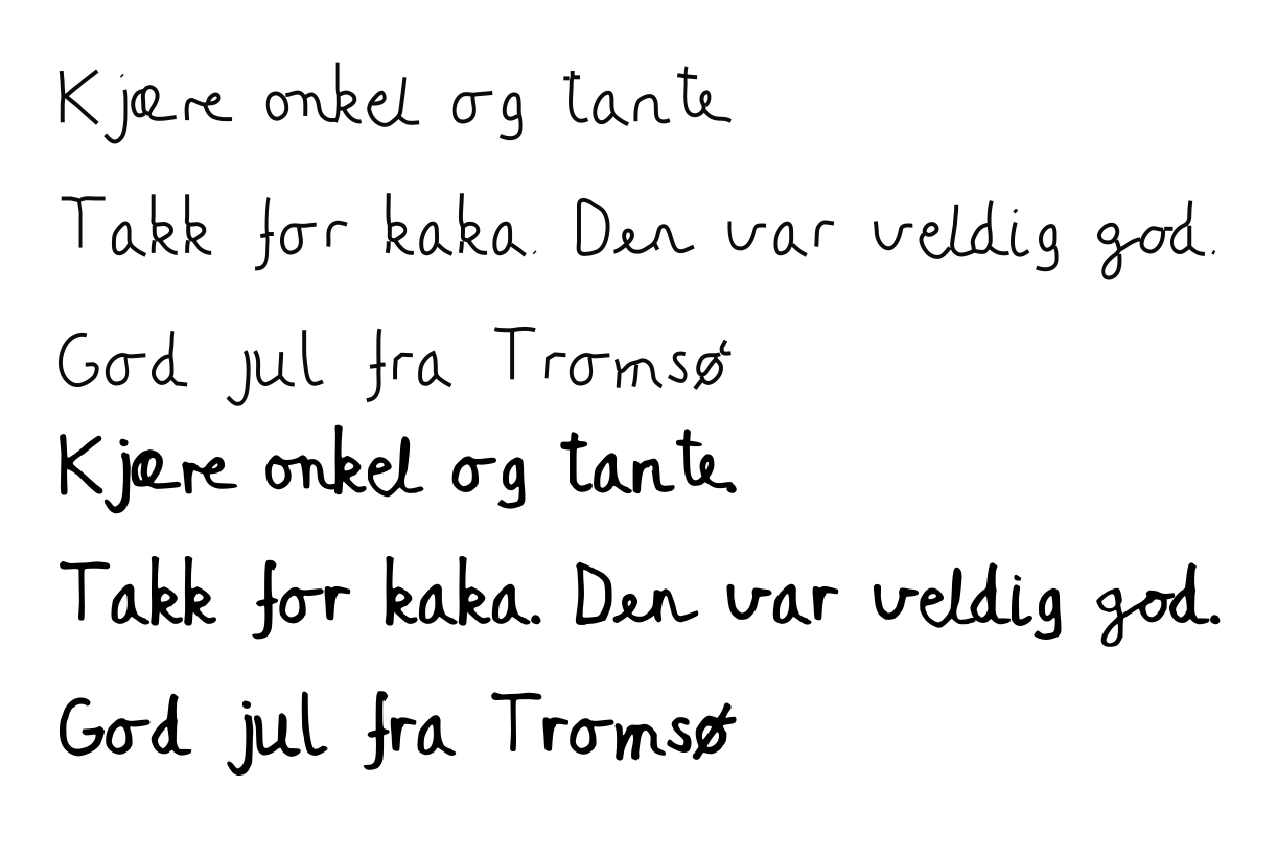
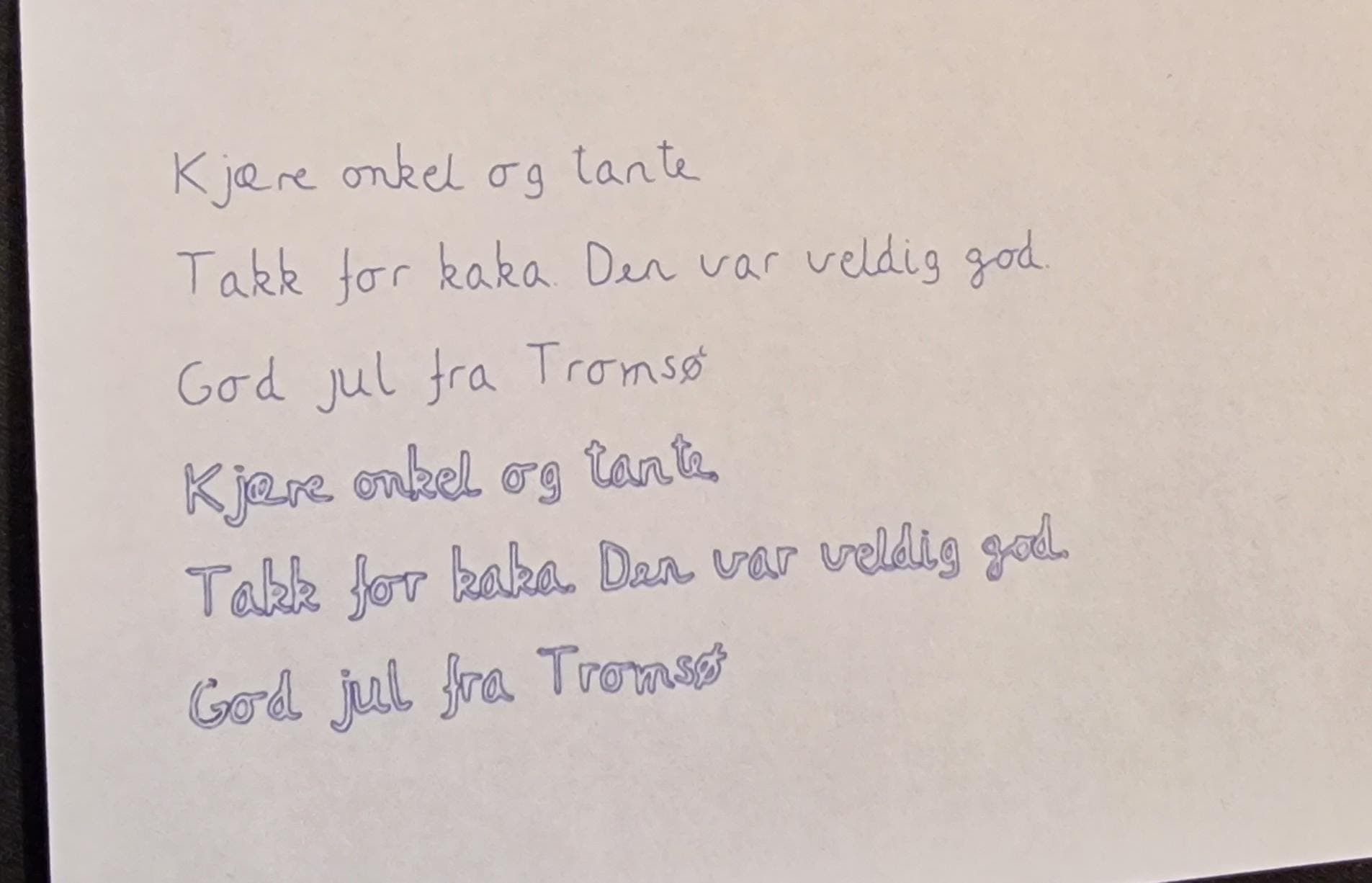
I’m currentlig strugglig with how to digitze my own hand writing. I’ve used calligraphr, an amazing tool for the task. I’ve even got ligatures for the most common letter combinations. If I’ll go further, I’ll make several variants for each letter - to make it seem even more natural.
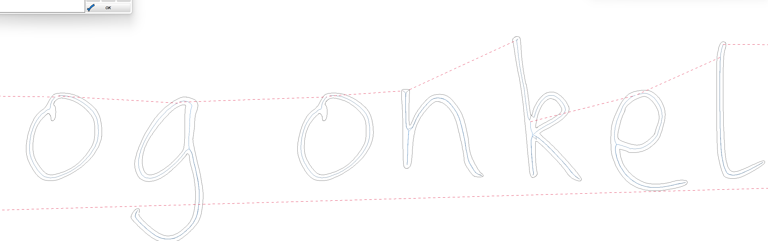
Well - the problem is finding a good centerline. I cannot use outline:
My first calligraphr try I had a much thinner fontface. That was even more awful when trying to centerline trace. That’s why the current font is so bold, I was hoping it would trace better.
Well, your first mistake is using cursive. Everyone knows you need to use block letters. Nobody (except maybe your grandmother, and her three spinster sisters who live together and share an eye) can read it anyway…
Hush now, I was trying to be polite and not embarrass him too much… You Germans and your frankness and brash honesty. Try a little compassionate diplomacy…
If my grandmother was alive she would be deliiiiighted to get a cursive looong letter. I actually have an old aunt that still writes us these letters by hand. She’s kinda the inspiration. But I’m not going to do this to her, that’s mean
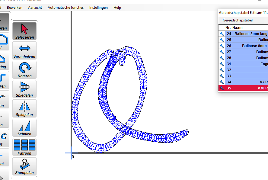
That might be the way! Just have to figure out how to set it up, so that I only get the center carve. Might need cleaning up all the letters with internal parts…
That is almost perfect. The J is right. The next letter might need to be careful in what order you select the outlines, and make sure it is a closed shape. I would select the outermost edge first, tell in inside, the one of the inner shapes tell it outside. You will need to select them individually.
Make sure your tip is defined as small enough 0.2mm or something small.
I was going to say inkscape had a option, but I’ve never used it. The other thing is you letters may not be connecting leading to the issues (sometimes software that we use to create a trace from a image doesn’t always connect the lines. But in inkscape you just need to mess with the fudge numbers some to get it right. I’d try following that video.
Amazing! The squiggly blue pattern confused me. It seemed like then pen would spin in circles. But looking at the gcode, they sure only move in one line:
This is definitively an imrovement. BUT - the paths are somehow “strange”, so it’ll still look a little phony. And every letter would need a clean up, before plotting. I think I’ll give a quick try converting the font to a centerline/stroke font. If not, this is one good option.
When I did this I had to trace each letter manually. Centerline trace really has a hard time when paths cross and most of the time it leaves an artifact where you can tell it hasn’t traced properly.
It might have been a fun project to develop a new algorithm to get centerline tracing working correctly, but I was after the product in this case, not the project.
Beautiful! I assume you have your christmas letters in order
It’s hard to figure out all the nuances with how deep the carve should go. I looked at the gcode, there’s different depth to the carve - at corners and starts/stops, even though it goes centerline.
As Jamie suggests, tracing it yourself is the proper way - makes it easy for quick production. I actually sent an email to the guy who made the stroke tool for inkscape, to hear if he does commissions… christmas is coming too quickly!!
Yeah it will go whatever depth is needed to go the full width, or you can limit the depth and let it clear out a flat bottom where needed. If you do a 1mm depth limit and a 10mm width you will see what happens in the preview, but with a font I think just letting it go as deep as needed would look best.


")
 my handwriting")