Fusion360 usage question which I have a feeling I know what the issue is and I have a work around but just wanted to get some other ideas before I over complicate things.
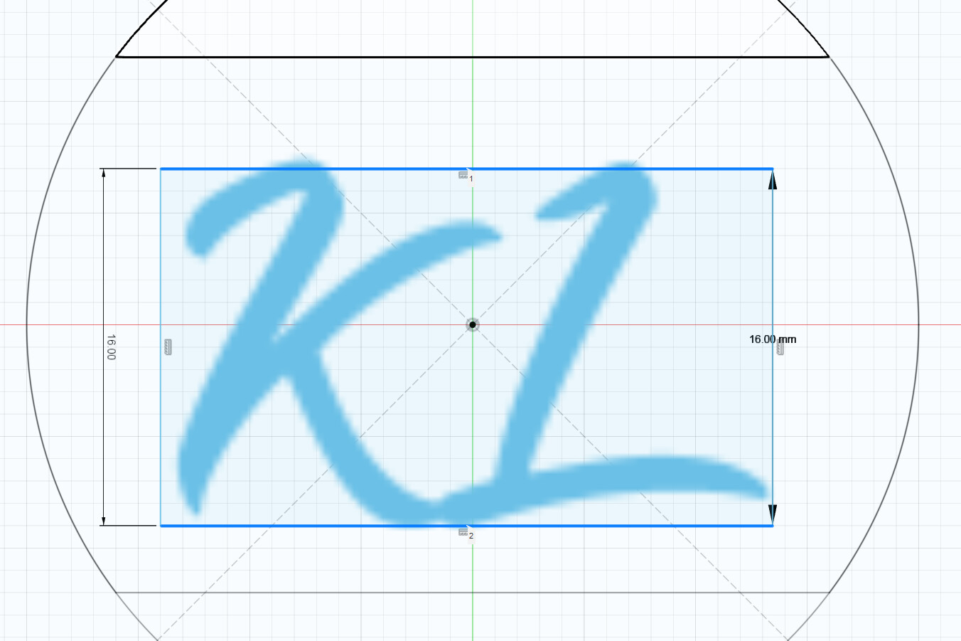
I have the Tahu font (Thanks @Tokoloshe) set to 16mm and then aligned vertically and horizontally.
However it is definitely not centered and definitely not 16mm.
My theory is it’s due to it not being a native font to Fusion360. I can fix it by capturing it in the correctly sized box and cantering that.
But has anyone come across this before?
Hey Melcour, it is centered, it just does not look like it. You can just compare the distance from the tip of the L to the right to the distance of the K to the left. It doesn’t look centered because the “optical weight” (I might have made up the term just now, don’t know about it (edit: I looked it up, seems to be called “Visual Weight”, really interesting)) lies on the “heavier” K, so it looks like it is moved a little to the left.
Regarding the font, I found another one that is also really beautiful and hits the same chords Tahu does, it’s called Beyond the Mountains. I have been using it for some projects where Tahu didn’t fit. Also, Belle Quest is a really, really nice font but very, very thin and hard to get right when doing an engraving (definitely needs a 30° endmill).
Thank you for the reply Philipp.
The visual weight explanation makes sense and is in an interesting read.
I will have to play around with Beyond the Mountains and Belle Quest.
The Bell Quest font looks beautiful.
Thanks again for the info.